Data visualization and analysis handbook (Apr 2019 v2)
Examples of visualizations: Mistake: Truncating the scale
Index
- Data visualization check list
- Chart selection
- Examples of visualizations
- Examples of makeovers – from bad to good
- How to develop a story with visualizations
- Resources
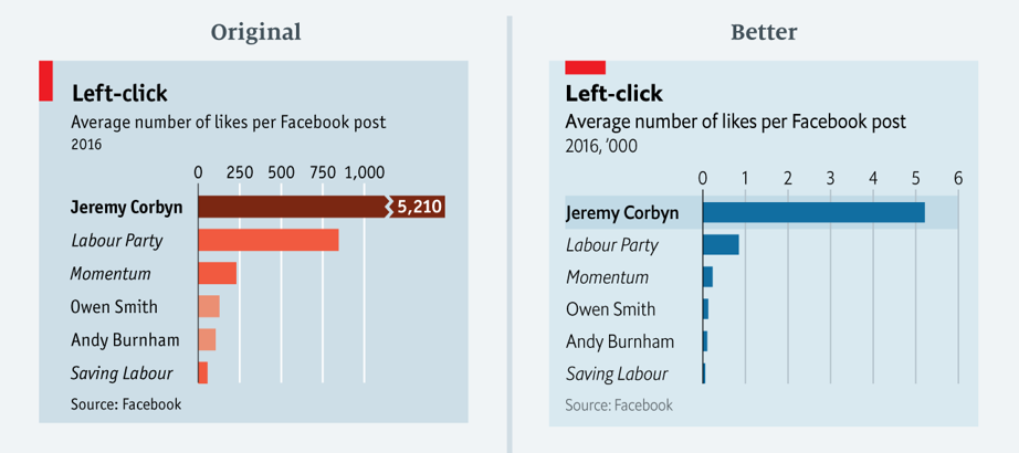
Mistake: Truncating the scale
Example 1
This chart shows the average number of Facebook likes on posts by pages of the political left. The point of this chart was to show the disparity between Mr Corbyn's posts and others. The original chart not only downplays the number of Mr Corbyn's likes but also exaggerates those on other posts. In the redesigned version, we show Mr Corbyn's bar in its entirety. All other bars remain visible.
Source: economist
Chart Index
| 1. Line Chart 1, 2, 3 | 16. Dumbbell (Connected) Dot Chart | 31. Heat maps |
| 2. Area Chart | 17. Histograms | 32. Doughnut |
| 3. Stacked Area Chart | 18. Boxplot | 33. Tree maps |
| 4. Slope Chart | 19. Scatterplot | 34. Stream Chart |
| 5. Horizontal Bar Chart | 20. Bubble Chart | 35. Parallel Coordinates (Parallel Sets) |
| 6. Column (Clustered) Bar Chart | 21. Icon Array (Unit, Pictograph, Isotype) | 36. Scatterplot matrix |
| 7. Bullet Chart | 22. Calendars | 37. Waterfall |
| 8. Dot (Lollipop) Chart | 23. Waffle | 38. Multi-set Bar Chart |
| 9. Stacked (Horizontal) Bar Chart | 24. Heat Tables | 39. Marimekko Chart |
| 10. Stacked Column Chart | 25. Circle Chart | 40. Nightingale Rose Chart |
| 11. Overlapping Bar Chart | 26. Spark Line | 41. Candlestick Chart |
| 12. Deviation Chart | 27. Density | 42. Radial Column Chart |
| 13. Diverging Stacked Bar Chart | 28. Small Multiples Line | 43. Radar Chart |
| 14. Population Pyramids | 29. Social Network | 44. Chord Diagram |
| 15. Span Chart | 30. Data Table | 45. Choropleth Map |
Combo Charts