Data visualization and analysis handbook (Apr 2019 v2)
Examples of visualizations: Horizontal Bar, Circle Chart
Index
- Data visualization check list
- Chart selection
- Examples of visualizations
- Examples of makeovers – from bad to good
- How to develop a story with visualizations
- Resources
Horizontal Bar, Circle Chart
Example 1
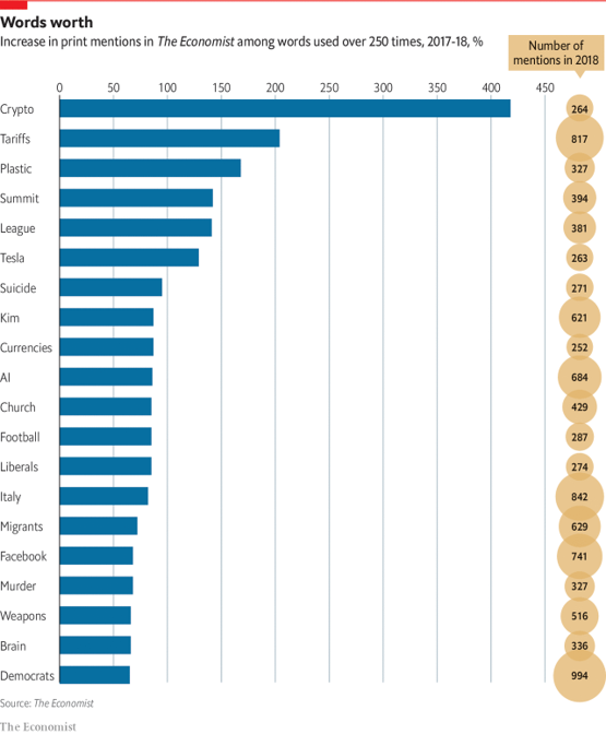
Source: economist
Example 2
Winter races are less popular than summer ones, but more exciting
Contests on snow and ice tend to be faster and less predictable
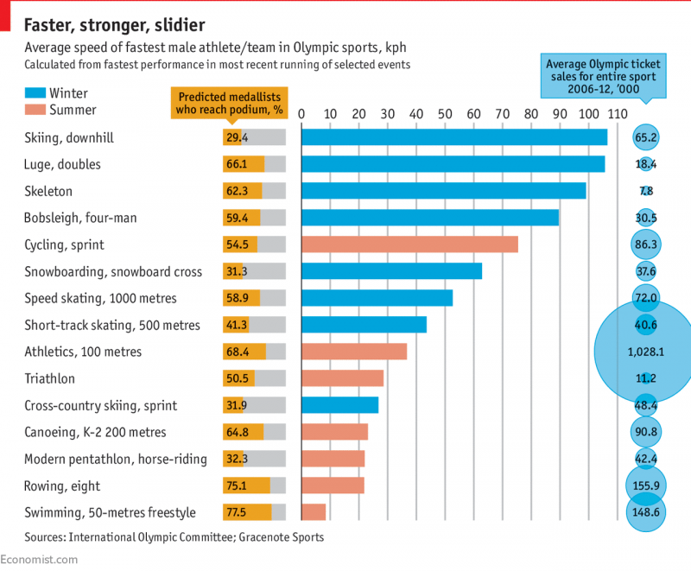
Source: economist
Chart Index
| 1. Line Chart 1, 2, 3 | 16. Dumbbell (Connected) Dot Chart | 31. Heat maps |
| 2. Area Chart | 17. Histograms | 32. Doughnut |
| 3. Stacked Area Chart | 18. Boxplot | 33. Tree maps |
| 4. Slope Chart | 19. Scatterplot | 34. Stream Chart |
| 5. Horizontal Bar Chart | 20. Bubble Chart | 35. Parallel Coordinates (Parallel Sets) |
| 6. Column (Clustered) Bar Chart | 21. Icon Array (Unit, Pictograph, Isotype) | 36. Scatterplot matrix |
| 7. Bullet Chart | 22. Calendars | 37. Waterfall |
| 8. Dot (Lollipop) Chart | 23. Waffle | 38. Multi-set Bar Chart |
| 9. Stacked (Horizontal) Bar Chart | 24. Heat Tables | 39. Marimekko Chart |
| 10. Stacked Column Chart | 25. Circle Chart | 40. Nightingale Rose Chart |
| 11. Overlapping Bar Chart | 26. Spark Line | 41. Candlestick Chart |
| 12. Deviation Chart | 27. Density | 42. Radial Column Chart |
| 13. Diverging Stacked Bar Chart | 28. Small Multiples Line | 43. Radar Chart |
| 14. Population Pyramids | 29. Social Network | 44. Chord Diagram |
| 15. Span Chart | 30. Data Table | 45. Choropleth Map |
Combo Charts