Data visualization and analysis handbook (Apr 2019 v2)
Examples of visualizations: 20. Bubble Chart
Index
- Data visualization check list
- Chart selection
- Examples of visualizations
- Examples of makeovers – from bad to good
- How to develop a story with visualizations
- Resources
20. Bubble Chart
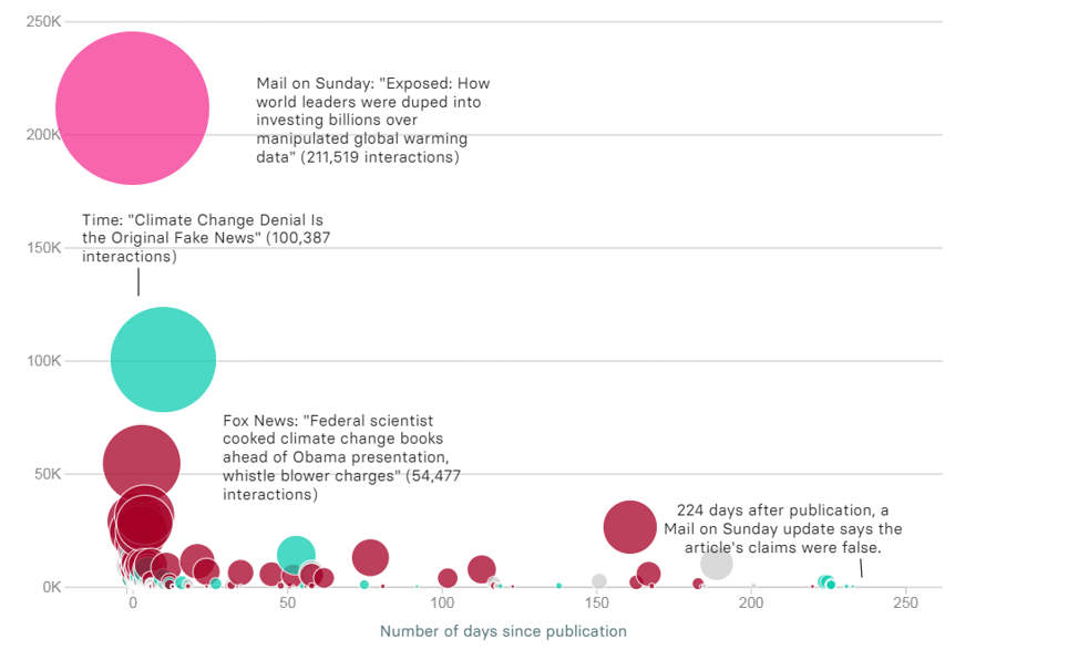
Bubble charts display correlations between three variables, x, y, and z. They're an extension of the scatter plot, which displays correlations between just two variables. x = first variable, shown on the x-axis y = second variable, shown on the y-axis z = third variable, represented by the bubble's size or area
https://depictdatastudio.com/charts/bubble/
Example 1

Example 2
Source: buzzfeednews