Data visualization and analysis handbook (Apr 2019 v2)
Data visualization check list
Index
- Data visualization check list
- Chart selection
- Examples of visualizations
- Examples of makeovers – from bad to good
- How to develop a story with visualizations
- Resources
Text
Graphs don't contain much text, so existing text must encapsulate your message and pack a punch.
6-12 word descriptive title is left-justified in upper left corner
Short titles enable readers to comprehend takeaway messages even while quickly skimming the graph. Rather than a generic phrase, use a descriptive sentence that encapsulates the graph's finding or "so what?" Western cultures start reading in the upper left, so locate the title there.
Subtitle and/or annotations provide additional information
Subtitles and annotations (call-out text within the graph) can add explanatory and interpretive power to a graph. Use them to answer questions a viewer might have or to highlight specific data points.
Text size is hierarchical and readable
Titles are in a larger size than subtitles or annotations, which are larger than labels, which are larger than axis labels, which are larger than source information. The smallest text - axis labels - are at least 9 point font size on paper, at least 20 on screen.
Text is horizontal
Titles, subtitles, annotations, and data labels are horizontal (not vertical or diagonal). Line labels and axis labels can deviate from this rule and still receive full points. Consider switching graph orientation (e.g., from column to bar chart) to make text horizontal.
Data are labeled directly
Position data labels near the data rather than in a separate legend (e.g., on top of or next to bars and next to lines). Eliminate/embed legends when possible because eye movement back and forth between the legend and the data can interrupt the brain's attempts to interpret the graph.
Labels are used sparingly
Focus attention by removing the redundancy. For example, in line charts, label every other year on an axis. Do not add numeric labels and use a y-axis scale, since this is redundant.
Arrangement
Improper arrangement of graph elements can confuse readers at best and mislead viewer at worst. Thoughtful arrangement makes a data visualization easier for a viewer to interpret.
Proportions are accurate
A viewer should be able measure the length or area of the graph with a ruler and find that it matches the relationship in the underlying data. Y-axis scales should be appropriate. Bar charts start axes at 0. Other graphs can have a minimum and maximum scale that reflects what should be an accurate interpretation of the data (e.g., the stock market ticker should not start at 0 or we won't see a meaningful pattern).
Data are intentionally ordered
Data should be displayed in an order that makes logical sense to the viewer. Data may be ordered by frequency counts (e.g., from greatest to least for nominal categories), by groupings or bins (e.g., histograms), by time period (e.g., line charts), alphabetically, etc. Use an order that supports interpretation of the data.
Axis intervals are equidistant
The spaces between axis intervals should be the same unit, even if every axis interval isn't labeled. Irregular data collection periods can be noted with markers on a line graph, for example.
Graph is two-dimensional
Avoid three-dimensional displays, bevels, and other distortions.
Display is free from decoration
Graph is free from clipart or other illustrations used solely for decoration. Some graphics, like icons, can support interpretation.
Color
Color scheme is intentional
Colors should represent brand or other intentional choice, not default color schemes. Use your organization's colors or your client's colors. Work with online tools to identify brand colors and others that are compatible.
Color is used to highlight key patterns
Action colors should guide the viewer to key parts of the display. Less important, supporting, or comparison data should be a muted color, like gray.
Color is legible when printed in black and white
When printed or photocopied in black and white, the viewer should still be able to see patterns in the data.
Color is legible for people with colorblindness
Avoid red-green and yellow-blue combinations when those colors touch one another. Avoid using red to mean bad and green to mean good in the same chart.
Text sufficiently contrasts background
Black/very dark text against a white/transparent background is easiest to read.
Lines
Excessive lines— gridlines, borders, tick marks, and axes—can add clutter or noise to a graph, so eliminate them whenever they aren't useful for interpreting the data.
Gridlines, if present, are muted
Color should be faint gray, not black. Full points if no gridlines are used. Gridlines, even muted, should not be used when the graph includes numeric labels on each data point.
Graph does not have border line
Graph should bleed into the surrounding page or slide rather than being contained by a border.
Axes do not have unnecessary tick marks or axis lines
Tick marks can be useful in line graphs (to demarcate each point in time along the y-axis) but are unnecessary in most other graph types. Remove axes lines whenever possible.
Graph has one horizontal and one vertical axis
Viewers can best interpret one x- and one y-axis. Don't add a second y-axis. Try a connected scatter plot or two graphs, side by side, instead. (A secondary axis used to hack new graph types is ok, so long as viewers aren't being asked to interpret a second y-axis.)
Overall
Graphs will catch a viewer's attention so only visualize the data that needs attention. Too many graphics of unimportant information dilute the power of visualization.
Graph highlights significant finding or conclusion
Graphs should have a "so what?" – either a practical or statistical significance (or both) to warrant their presence. For example, contextualized or comparison data help the viewer understand the significance of the data and give the graph more interpretive power.
The type of graph is appropriate for data
Data are displayed using a graph type appropriate for the relationship within the data. For example, change over time is displayed as a line graph, area chart, slope graph, or dot plot.
Graph has appropriate level of precision
Use a level of precision that meets your audiences' needs. Few numeric labels need decimal places, unless you are speaking with academic peers. Charts intended for public consumption rarely need p values listed.
Individual chart elements work together to reinforce the overarching takeaway message
Choices about graph type, text, arrangement, color, and lines should reinforce the same takeaway message.
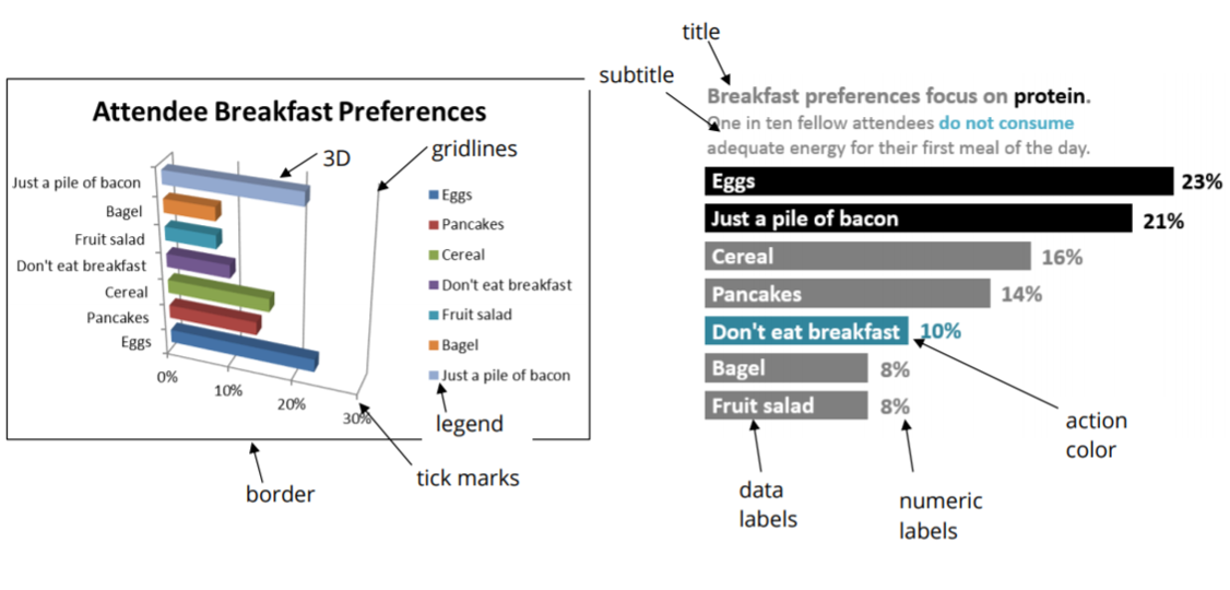
Data Visualization Anatomy Chart


reference: by Stephanie Evergreen & Ann K. Emery February 2018