Data visualization and analysis handbook (Apr 2019 v2)
Chart selection
Index
- Data visualization check list
- Chart selection
- Examples of visualizations
- Examples of makeovers – from bad to good
- How to develop a story with visualizations
- Resources
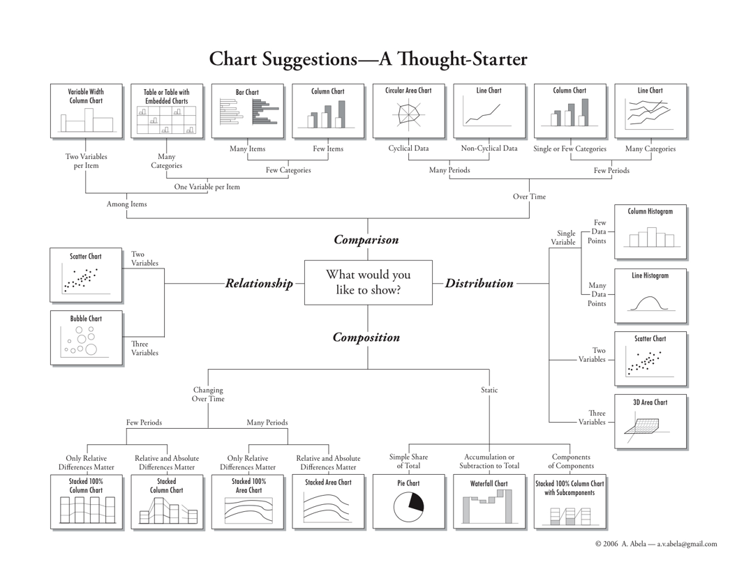
Source: chart suggestions - a thought starter
The general data insight that corresponds to each data classification
| Data | Example | Insight | Chart type |
|---|---|---|---|
| Categorical | Non-numeric data such as types of movies, books, or authors. | Comparisons, proportions | Vertical bar, column bar, horizontal bar, and bullet charts Pie, stacked bar, stacked 100% bar, stacked area, stacked 100% area, and a tree map |
| Univariate | One numeric variable, such as book price | Distributions, proportions, frequencies | Histogram, density plot, and a boxplot |
| Geospatial | Specific locations marked by the latitude and longitude, regions coded by zip code, city, state, country, or county boundaries | Locations, comparisons, trends | Choropleth filled-map, bubble map, point map, connection map, and isopleth map |
| Multivariate | Two or more numeric variables, for example, weight, height, and IQ | Relationships, proportions, comparisons | Scatterplot, scatterplot matrix, bubble, parallel coordinates, radar, bullet, and a heat map. |
| Time series | Years, months, days, hours, minutes, seconds, or date | Trends, comparisons, cycles | Line chart, sparkline, area, stream graph, as well as bubble, stacked-area, and vertical bar charts. |
| Text | Single words or phrases, such as keywords from restaurant reviews on Yelp | Sentiment, comparisons, frequency | Word cloud, proportional area chart using size bubbles or squares, histogram, and bar chart |
| Edge lists or adjacency matrices | Who contacts whom or who knows whom in a network | Connections, relationships, tie strength, centrality, interactions | Undirected network diagram and directed network diagram |
Source: Sosulski, Kristen. Data Visualization Made Simple (Page 46). Taylor and Francis.