Data visualization and analysis handbook (Apr 2019 v2)
Examples of visualizations: 19. Scatterplot
Index
- Data visualization check list
- Chart selection
- Examples of visualizations
- Examples of makeovers – from bad to good
- How to develop a story with visualizations
- Resources
19. Scatterplot
Display correlations between two continuous variables. For example, you could display heights and weights or grade point averages and standardized test scores. Scatter plots are a staple from your college statistics course, but they tend to be less recognizable among everyday people who haven't taken those same statistics courses.
https://depictdatastudio.com/charts/scatter-plots/
Example 1
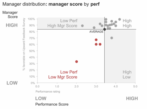
Source: storytellingwithdata
Example 2
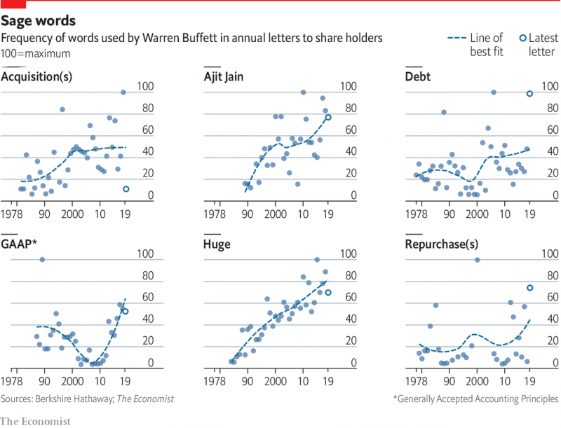
Source: economist
Example 3
Republicans are less divided on cultural issues than Democrats are
The party turned Trumpy before the 2016 election, not after
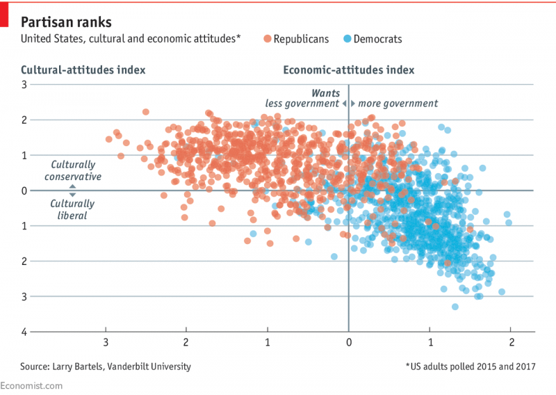
Source: economist
Example 4
What do Democrats and Republicans both like?
Members of both parties hate Congress equally
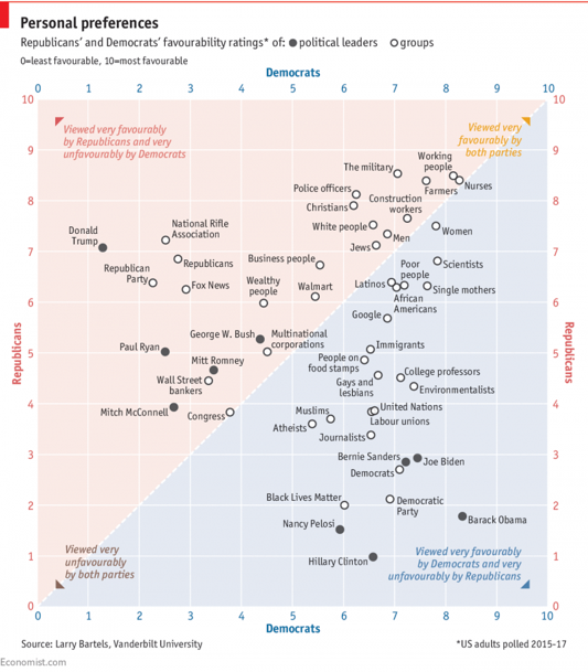
Source: economist