Data visualization and analysis handbook (Apr 2019 v2)
Examples of visualizations: 1. Line Chart
Index
- Data visualization check list
- Chart selection
- Examples of visualizations
- Examples of makeovers – from bad to good
- How to develop a story with visualizations
- Resources
1. Line Chart
Use line chart to show patterns over time https://depictdatastudio.com/charts/line/
Example 1
It's time to think about refinancing your mortgage
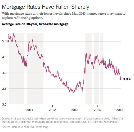
Source: https://twitter.com/nytimes/status/557702398110875648
Example 2
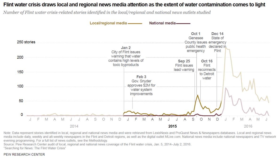
Source: https://www.journalism.org/essay/searching-for-news/
Example 3
The myth of the 2017 ‘youthquake' election
Younger voters were still much less likely to vote, older voters much more so. The graph below shows the predicted probability of turning out in the election, by age. Among the youngest voters, the margin of error means that we cannot rule out a small increase - or decrease - in 2017.
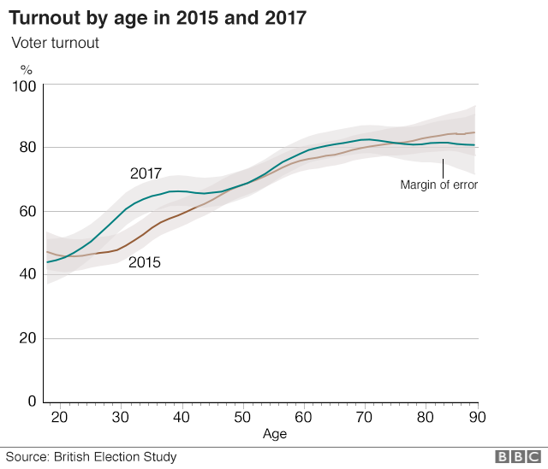
- Apply light shading above and below your line to indicate margins of error.
- You can shade +/- a standard deviation, a confidence interval, and more.
https://www.pewhispanic.org/interactives/unauthorized-trends/
Source: https://www.bbc.com/news/uk-politics-42747342
Example 4
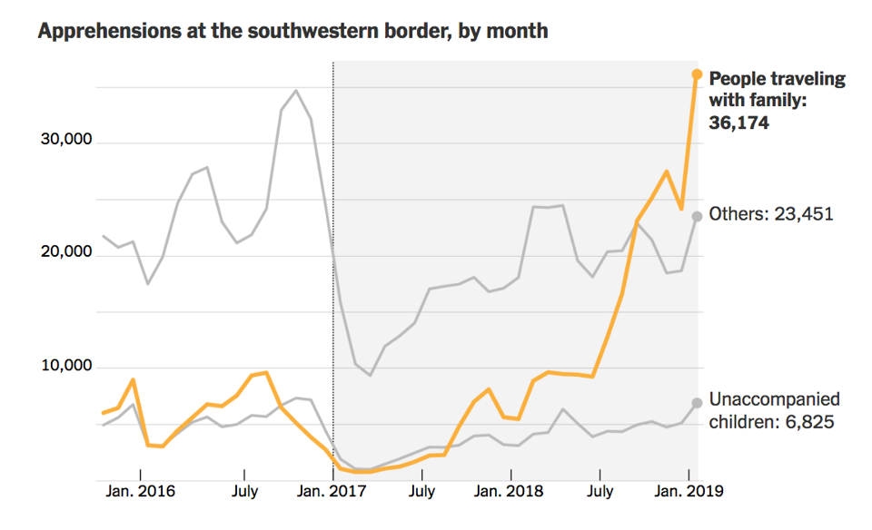
Source: http://www.thefunctionalart.com/2019/03/when-your-own-data-contradicts-your.html