Data visualization and analysis handbook (Apr 2019 v2)
Examples of visualizations: 25. Circle Chart
Index
- Data visualization check list
- Chart selection
- Examples of visualizations
- Examples of makeovers – from bad to good
- How to develop a story with visualizations
- Resources
25. Circle Chart
Example 1
How Does This Compare to Past Outbreaks? It is the deadliest, eclipsing an outbreak in 1976, the year the virus was discovered.
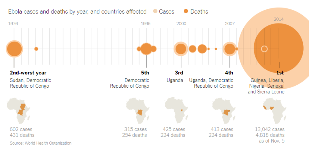
Source: NYTimes
Example 2
The Rohingya refugee crisis is the worst in decades
The weekly outflow from Myanmar is the highest since the Rwandan genocide
ON AUGUST 25th a group of militant Rohingya Muslims attacked police bases in northern Myanmar. The army retaliated with untrammelled fury, burning villages, killing civilians and raping women. More than 420,000 terrified Rohingyas have crossed the border into Bangladesh. The UN's International Organisation for Migration (IOM) has proclaimed the exodus "unprecedented in terms of volume and speed", and Zeid Ra'ad al-Hussein, the UN's human-rights chief, called it a "textbook example of ethnic cleansing".
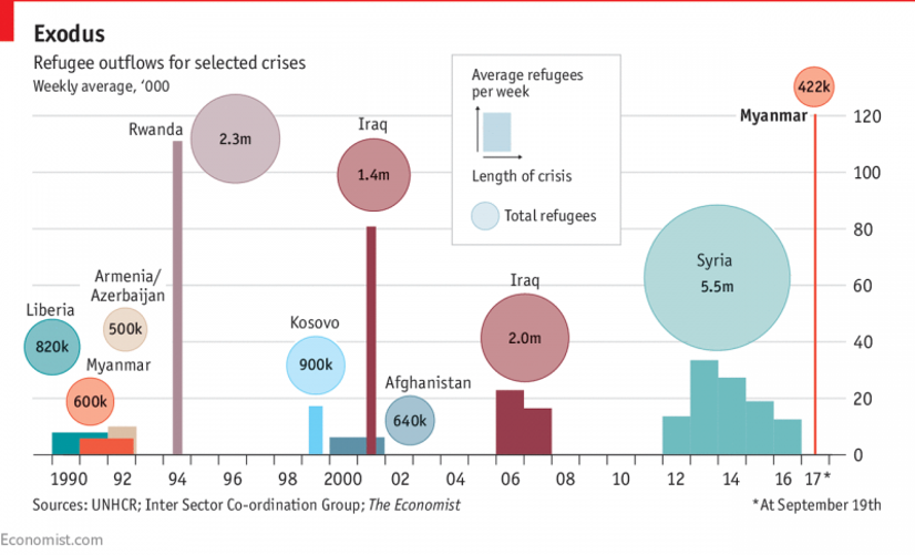
Source: economist