Data visualization and analysis handbook (Apr 2019 v2)
Examples of visualizations: 29. Social Network
Index
- Data visualization check list
- Chart selection
- Examples of visualizations
- Examples of makeovers – from bad to good
- How to develop a story with visualizations
- Resources
29. Social Network
Social network maps are for visualizing relationships or connections between people or between organizations. Each dot or node represents one person (e.g., a Twitter handle).
Each line or edge represents their relationship or connection (e.g., whether someone retweeted another person).
https://depictdatastudio.com/charts/social-network-maps/
Example 1
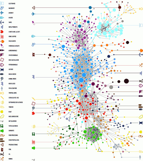
Source: analytics-magazine.org