Data visualization and analysis handbook (Apr 2019 v2)
Examples of visualizations: 13. Diverging Stacked Bar Chart
Index
- Data visualization check list
- Chart selection
- Examples of visualizations
- Examples of makeovers – from bad to good
- How to develop a story with visualizations
- Resources
13. Diverging Stacked Bar Chart
An invisible y-axis separates the good/bad, positive/negative, or agree/disagree categories.
https://depictdatastudio.com/charts/diverging-stacked-bar/
Example 1
70% of Hispanics say earth is getting warmer due to human activity–compared w/ 44% of whites.
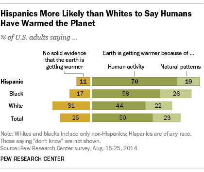
Source: twitter
Example 2
The French held more favorable views of both Jews & Muslims than many other Europeans
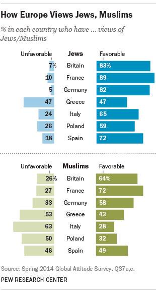
Source: twitter