Kaufman Efficiency Ratio
References
- tc2000: kaufman-efficiency-ratio
- Using Efficiency Ratio in your Technical Analysis
- tradingview: Efficiency Ratio (Market Noise) by Alejandro P
- Trading strategy: Kaufman Efficiency Ratio
Definition
- The Efficiency Ratio was invented by Perry J. Kaufman and presented in his book “New Trading Systems and Methods”.
- It is calculated by dividing the net change in price movement over N periods by the sum of the absolute net changes over the same N periods.
Calculation
Load basic packages
import pandas as pd
import numpy as np
import os
import gc
import copy
from pathlib import Path
from datetime import datetime, timedelta, time, date
#this package is to download equity price data from yahoo finance
#the source code of this package can be found here: https://github.com/ranaroussi/yfinance/blob/main
import yfinance as yf
pd.options.display.max_rows = 100
pd.options.display.max_columns = 100

import warnings
warnings.filterwarnings("ignore")

import pytorch_lightning as pl
random_seed=1234
pl.seed_everything(random_seed)
Global seed set to 1234


1234
#S&P 500 (^GSPC),  Dow Jones Industrial Average (^DJI), NASDAQ Composite (^IXIC)
#Russell 2000 (^RUT), Crude Oil Nov 21 (CL=F), Gold Dec 21 (GC=F)
#Treasury Yield 10 Years (^TNX)

#benchmark_tickers = ['^GSPC', '^DJI', '^IXIC', '^RUT',  'CL=F', 'GC=F', '^TNX']

benchmark_tickers = ['^GSPC']
tickers = benchmark_tickers + ['GSK', 'NVO', 'AROC']
#https://github.com/ranaroussi/yfinance/blob/main/yfinance/base.py
#     def history(self, period="1mo", interval="1d",
#                 start=None, end=None, prepost=False, actions=True,
#                 auto_adjust=True, back_adjust=False,
#                 proxy=None, rounding=False, tz=None, timeout=None, **kwargs):

dfs = {}

for ticker in tickers:
    cur_data = yf.Ticker(ticker)
    hist = cur_data.history(period="max", start='2000-01-01')
    print(datetime.now(), ticker, hist.shape, hist.index.min(), hist.index.max())
    dfs[ticker] = hist
2022-09-10 22:12:05.898833 ^GSPC (5710, 7) 1999-12-31 00:00:00 2022-09-09 00:00:00
2022-09-10 22:12:06.293052 GSK (5710, 7) 1999-12-31 00:00:00 2022-09-09 00:00:00
2022-09-10 22:12:06.683997 NVO (5710, 7) 1999-12-31 00:00:00 2022-09-09 00:00:00
2022-09-10 22:12:06.957627 AROC (3791, 7) 2007-08-21 00:00:00 2022-09-09 00:00:00
ticker = 'GSK'
dfs[ticker].tail(5)
| Open | High | Low | Close | Volume | Dividends | Stock Splits | |
|---|---|---|---|---|---|---|---|
| Date | |||||||
| 2022-09-02 | 31.600000 | 31.969999 | 31.469999 | 31.850000 | 8152600 | 0.0 | 0.0 |
| 2022-09-06 | 31.650000 | 31.760000 | 31.370001 | 31.469999 | 5613900 | 0.0 | 0.0 |
| 2022-09-07 | 31.209999 | 31.590000 | 31.160000 | 31.490000 | 4822000 | 0.0 | 0.0 |
| 2022-09-08 | 30.910000 | 31.540001 | 30.830000 | 31.510000 | 6620900 | 0.0 | 0.0 |
| 2022-09-09 | 31.950001 | 31.969999 | 31.730000 | 31.889999 | 3556800 | 0.0 | 0.0 |
Define Kaufman Efficiency Ratio calculation function
#https://github.com/peerchemist/finta/blob/af01fa594995de78f5ada5c336e61cd87c46b151/finta/finta.py


def cal_er(ohlc: pd.DataFrame, period: int = 10, column: str = "close", is_abs: bool =True) -> pd.Series:
    """
    The Kaufman Efficiency indicator is an oscillator indicator that oscillates between 0 and 1.


     """
    if is_abs:
        change = ohlc[column].diff(period).abs()
    else:
        change = ohlc[column].diff(period)
    volatility = ohlc[column].diff().abs().rolling(window=period).sum()

    return pd.Series(change / volatility, name=f"ER{period}")
Calculate Kaufman Efficiency Ratio
df = dfs[ticker][['Open', 'High', 'Low', 'Close', 'Volume']]
df = df.round(2)
cal_er
<function __main__.cal_er(ohlc: pandas.core.frame.DataFrame, period: int = 10, column: str = 'close', is_abs: bool = True) -> pandas.core.series.Series>
df_ta = cal_er(df, period = 14, column='Close')
df = df.merge(df_ta, left_index = True, right_index = True, how='inner' )

del df_ta
gc.collect()
80
df_ta = cal_er(df, period = 9, column='Close', is_abs = False)
df = df.merge(df_ta, left_index = True, right_index = True, how='inner' )

del df_ta
gc.collect()
42
display(df.head(5))
display(df.tail(5))
| Open | High | Low | Close | Volume | ER14 | ER9 | |
|---|---|---|---|---|---|---|---|
| Date | |||||||
| 1999-12-31 | 19.60 | 19.67 | 19.52 | 19.56 | 139400 | NaN | NaN |
| 2000-01-03 | 19.58 | 19.71 | 19.25 | 19.45 | 556100 | NaN | NaN |
| 2000-01-04 | 19.45 | 19.45 | 18.90 | 18.95 | 367200 | NaN | NaN |
| 2000-01-05 | 19.21 | 19.58 | 19.08 | 19.58 | 481700 | NaN | NaN |
| 2000-01-06 | 19.38 | 19.43 | 18.90 | 19.30 | 853800 | NaN | NaN |
| Open | High | Low | Close | Volume | ER14 | ER9 | |
|---|---|---|---|---|---|---|---|
| Date | |||||||
| 2022-09-02 | 31.60 | 31.97 | 31.47 | 31.85 | 8152600 | 0.672457 | -0.753425 |
| 2022-09-06 | 31.65 | 31.76 | 31.37 | 31.47 | 5613900 | 0.824818 | -0.758389 |
| 2022-09-07 | 31.21 | 31.59 | 31.16 | 31.49 | 4822000 | 0.787709 | -0.728571 |
| 2022-09-08 | 30.91 | 31.54 | 30.83 | 31.51 | 6620900 | 0.774011 | -0.847328 |
| 2022-09-09 | 31.95 | 31.97 | 31.73 | 31.89 | 3556800 | 0.581769 | -0.528455 |
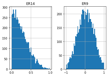
df[['ER14', 'ER9']].hist(bins=50)
array([[<AxesSubplot:title={'center':'ER14'}>,
        <AxesSubplot:title={'center':'ER9'}>]], dtype=object)
#https://github.com/matplotlib/mplfinance
#this package help visualize financial data
import mplfinance as mpf
import matplotlib.colors as mcolors
# all_colors = list(mcolors.CSS4_COLORS.keys())#"CSS Colors"
all_colors = list(mcolors.TABLEAU_COLORS.keys()) # "Tableau Palette",
# all_colors = list(mcolors.BASE_COLORS.keys()) #"Base Colors",
#https://github.com/matplotlib/mplfinance/issues/181#issuecomment-667252575
#list of colors: https://matplotlib.org/stable/gallery/color/named_colors.html
#https://github.com/matplotlib/mplfinance/blob/master/examples/styles.ipynb
def make_3panels2(main_data, mid_panel, chart_type='candle', names=None,
figratio=(14,9), fill_weights = (0, 0)):
"""
main chart type: default is candle. alternatives: ohlc, line
example:
start = 200
names = {'main_title': 'MAMA: MESA Adaptive Moving Average',
'sub_tile': 'S&P 500 (^GSPC)', 'y_tiles': ['price', 'Volume [$10^{6}$]']}
make_candle(df.iloc[-start:, :5], df.iloc[-start:][['MAMA', 'FAMA']], names = names)
"""
style = mpf.make_mpf_style(base_mpf_style='yahoo', #charles
base_mpl_style = 'seaborn-whitegrid',
# marketcolors=mpf.make_marketcolors(up="r", down="#0000CC",inherit=True),
gridcolor="whitesmoke",
gridstyle="--", #or None, or - for solid
gridaxis="both",
edgecolor = 'whitesmoke',
facecolor = 'white', #background color within the graph edge
figcolor = 'white', #background color outside of the graph edge
y_on_right = False,
rc = {'legend.fontsize': 'small',#or number
#'figure.figsize': (14, 9),
'axes.labelsize': 'small',
'axes.titlesize':'small',
'xtick.labelsize':'small',#'x-small', 'small','medium','large'
'ytick.labelsize':'small'
},
)
if (chart_type is None) or (chart_type not in ['ohlc', 'line', 'candle', 'hollow_and_filled']):
chart_type = 'candle'
len_dict = {'candle':2, 'ohlc':3, 'line':1, 'hollow_and_filled':2}
kwargs = dict(type=chart_type, figratio=figratio, volume=True, volume_panel=2,
panel_ratios=(4,2,1), tight_layout=True, style=style, returnfig=True)
if names is None:
names = {'main_title': '', 'sub_tile': ''}
added_plots = { }
fb_bbands2_ = dict(y1=fill_weights[0]*np.ones(mid_panel.shape[0]),
y2=fill_weights[1]*np.ones(mid_panel.shape[0]),color="lightskyblue",alpha=0.1,interpolate=True)
fb_bbands2_['panel'] = 1
fb_bbands= [fb_bbands2_]
i = 0
for name_, data_ in mid_panel.iteritems():
added_plots[name_] = mpf.make_addplot(data_, panel=1, color=all_colors[i])
i = i + 1
fig, axes = mpf.plot(main_data, **kwargs,
addplot=list(added_plots.values()),
fill_between=fb_bbands)
# add a new suptitle
fig.suptitle(names['main_title'], y=1.05, fontsize=12, x=0.1285)
axes[0].set_title(names['sub_tile'], fontsize=10, style='italic', loc='left')
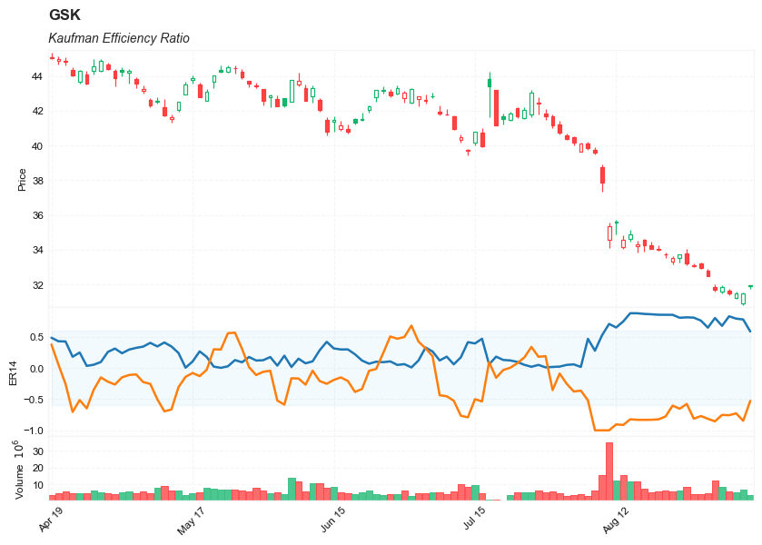
axes[2].set_ylabel('ER14')
# axes[0].set_ylabel(names['y_tiles'][0])
# axes[2].set_ylabel(names['y_tiles'][1])
return fig, axes
start = -100
end = df.shape[0]

names = {'main_title': f'{ticker}',
         'sub_tile': 'Kaufman Efficiency Ratio'}


aa_, bb_ = make_3panels2(df.iloc[start:end][['Open', 'High', 'Low', 'Close', 'Volume']],
             df.iloc[start:end][['ER14', 'ER9']],
             chart_type='hollow_and_filled',names = names,
                         fill_weights = (-0.6, 0.6))
#https://github.com/matplotlib/mplfinance
#this package help visualize financial data
import mplfinance as mpf
import matplotlib.colors as mcolors
# all_colors = list(mcolors.CSS4_COLORS.keys())#"CSS Colors"
all_colors = list(mcolors.TABLEAU_COLORS.keys()) # "Tableau Palette",
# all_colors = list(mcolors.BASE_COLORS.keys()) #"Base Colors",
#https://github.com/matplotlib/mplfinance/issues/181#issuecomment-667252575
#list of colors: https://matplotlib.org/stable/gallery/color/named_colors.html
#https://github.com/matplotlib/mplfinance/blob/master/examples/styles.ipynb
def make_3panels2(main_data, mid_panel, chart_type='candle', names=None,
figratio=(14,9)):
"""
main chart type: default is candle. alternatives: ohlc, line
example:
start = 200
names = {'main_title': 'MAMA: MESA Adaptive Moving Average',
'sub_tile': 'S&P 500 (^GSPC)', 'y_tiles': ['price', 'Volume [$10^{6}$]']}
make_candle(df.iloc[-start:, :5], df.iloc[-start:][['MAMA', 'FAMA']], names = names)
"""
style = mpf.make_mpf_style(base_mpf_style='yahoo', #charles
base_mpl_style = 'seaborn-whitegrid',
# marketcolors=mpf.make_marketcolors(up="r", down="#0000CC",inherit=True),
gridcolor="whitesmoke",
gridstyle="--", #or None, or - for solid
gridaxis="both",
edgecolor = 'whitesmoke',
facecolor = 'white', #background color within the graph edge
figcolor = 'white', #background color outside of the graph edge
y_on_right = False,
rc = {'legend.fontsize': 'small',#or number
#'figure.figsize': (14, 9),
'axes.labelsize': 'small',
'axes.titlesize':'small',
'xtick.labelsize':'small',#'x-small', 'small','medium','large'
'ytick.labelsize':'small'
},
)
if (chart_type is None) or (chart_type not in ['ohlc', 'line', 'candle', 'hollow_and_filled']):
chart_type = 'candle'
len_dict = {'candle':2, 'ohlc':3, 'line':1, 'hollow_and_filled':2}
kwargs = dict(type=chart_type, figratio=figratio, volume=True, volume_panel=2,
panel_ratios=(4,2,1), tight_layout=True, style=style, returnfig=True)
if names is None:
names = {'main_title': '', 'sub_tile': ''}
added_plots = { }
i = 0
for name_, data_ in mid_panel.iteritems():
#added_plots[name_] = mpf.make_addplot(data_, panel=1, color=all_colors[i])
p,g, b, r = data_.copy(), data_.copy(), data_.copy(), data_.copy()
p[p<0.95]=0
g[(g>=0.95) | (g<0.50)]=0
b[(b>=0.50) | (b<0.25)]=0
r[r>=0.25]=0
added_plots[name_+'_bar0'] = mpf.make_addplot(p,type='bar',width=0.7,panel=1,
color="darkviolet",alpha=0.65,secondary_y=False)
added_plots[name_+'_bar1'] = mpf.make_addplot(g,type='bar',width=0.7,panel=1,
color="limegreen",alpha=0.65,secondary_y=False)
added_plots[name_+'_bar3'] = mpf.make_addplot(r,type='bar',width=0.7,panel=1,
color="crimson",alpha=0.65,secondary_y=False)
added_plots[name_+'_bar4'] = mpf.make_addplot(b,type='bar',width=0.7,panel=1,
color="royalblue",alpha=0.65,secondary_y=False)
i = i + 1
fig, axes = mpf.plot(main_data, **kwargs,
addplot=list(added_plots.values()))
# add a new suptitle
fig.suptitle(names['main_title'], y=1.05, fontsize=12, x=0.1285)
axes[0].set_title(names['sub_tile'], fontsize=10, style='italic', loc='left')
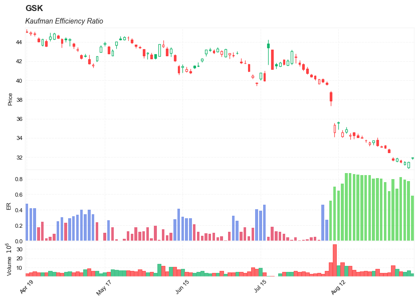
axes[2].set_ylabel('ER')
# axes[0].set_ylabel(names['y_tiles'][0])
# axes[2].set_ylabel(names['y_tiles'][1])
return fig, axes
start = -100
end = df.shape[0]

names = {'main_title': f'{ticker}',
         'sub_tile': 'Kaufman Efficiency Ratio'}


aa_, bb_ = make_3panels2(df.iloc[start:end][['Open', 'High', 'Low', 'Close', 'Volume']],
             df.iloc[start:end][['ER14']],
             chart_type='hollow_and_filled',names = names)