Choppiness Index (CHOP)
References
Definition
- The Choppiness Index (CHOP) is an indicator designed to determine if the market is choppy (trading sideways) or not choppy (trading within a trend in either direction).
- The Choppiness Index is an example of an indicator that is not directional at all. CHOP is not meant to predict future market direction, it is a metric to be used to for defining the market’s trendiness only. A basic understanding of the indicator would be; higher values equal more choppiness, while lower values indicate directional trending.
- The Choppiness Index was created by Australian commodity trader E.W. Dreiss.
Calculation
100 * LOG10( SUM(ATR(1), n) / ( MaxHi(n) - MinLo(n) ) ) / LOG10(n)
- n = User defined period length.
- LOG10(n) = base-10 LOG of n
- ATR(1) = Average True Range (Period of 1)
- SUM(ATR(1), n) = Sum of the Average True Range over past n bars
- MaxHi(n) = The highest high over past n bars
- MinLo(n) = The lowest low over past n bars
Read the indicator
- As a range-bound oscillator, The Choppiness Index has values that always fall within a certain range. CHOP produces values that operate between 0 and 100.
- The closer the value is to 100, the higher the choppiness (sideways movement) levels.
- The closer the value is to 0, the stronger the market is trending (directional movement)
- Often times, technical analysts will use a threshold on the higher end to indicate the market moving into choppiness territory. Likewise there will be a threshold in the lower zone to indicate trending territory. Common threshold values are popular Fibonacci Retracements. 61.8 for the high threshold and 38.2 for the lower threshold.
- Market Condition Confirmation
- The first way that technical analysts can use CHOP is to confirm current market conditions. With readings above the upper threshold, continued sideways movement maybe expected.
- Readings below the lower threshold may indicate a continuing trend.
- Upcoming Trendiness Change
- The second practical use for CHOP is anticipating changes in the market’s trendiness. It is generally believed that extended periods of consolidation (sideways trading) are followed by an extended period of trending (strong, directional movement) and vice versa.
The Choppiness Index is an interesting metric which can be useful in identifying ranges or trends. What analysts need to be wary of, is identifying when a range or trend is likely to continue and when it is likely to reverse. The best way to accomplish this would be by combining CHOP with additional charting tools and analysis. For example, using CHOP in conjunction with trend lines and traditional pattern recognition.
Load basic packages
import pandas as pd
import numpy as np
import os
import gc
import copy
from pathlib import Path
from datetime import datetime, timedelta, time, date
#this package is to download equity price data from yahoo finance
#the source code of this package can be found here: https://github.com/ranaroussi/yfinance/blob/main
import yfinance as yf
pd.options.display.max_rows = 100
pd.options.display.max_columns = 100

import warnings
warnings.filterwarnings("ignore")

import pytorch_lightning as pl
random_seed=1234
pl.seed_everything(random_seed)
Global seed set to 1234


1234
#S&P 500 (^GSPC),  Dow Jones Industrial Average (^DJI), NASDAQ Composite (^IXIC)
#Russell 2000 (^RUT), Crude Oil Nov 21 (CL=F), Gold Dec 21 (GC=F)
#Treasury Yield 10 Years (^TNX)

#benchmark_tickers = ['^GSPC', '^DJI', '^IXIC', '^RUT',  'CL=F', 'GC=F', '^TNX']

benchmark_tickers = ['^GSPC']
tickers = benchmark_tickers + ['GSK', 'NVO', 'PFE', 'DAL']
#https://github.com/ranaroussi/yfinance/blob/main/yfinance/base.py
#     def history(self, period="1mo", interval="1d",
#                 start=None, end=None, prepost=False, actions=True,
#                 auto_adjust=True, back_adjust=False,
#                 proxy=None, rounding=False, tz=None, timeout=None, **kwargs):

dfs = {}

for ticker in tickers:
    cur_data = yf.Ticker(ticker)
    hist = cur_data.history(period="max", start='2000-01-01')
    print(datetime.now(), ticker, hist.shape, hist.index.min(), hist.index.max())
    dfs[ticker] = hist
2022-09-05 18:45:50.232427 ^GSPC (5706, 7) 1999-12-31 00:00:00 2022-09-02 00:00:00
2022-09-05 18:45:50.576080 GSK (5706, 7) 1999-12-31 00:00:00 2022-09-02 00:00:00
2022-09-05 18:45:50.861057 NVO (5706, 7) 1999-12-31 00:00:00 2022-09-02 00:00:00
2022-09-05 18:45:51.234151 PFE (5706, 7) 1999-12-31 00:00:00 2022-09-02 00:00:00
2022-09-05 18:45:51.467694 DAL (3863, 7) 2007-05-03 00:00:00 2022-09-02 00:00:00
ticker = 'DAL'
dfs[ticker].tail(5)
| Open | High | Low | Close | Volume | Dividends | Stock Splits | |
|---|---|---|---|---|---|---|---|
| Date | |||||||
| 2022-08-29 | 32.200001 | 32.349998 | 31.850000 | 32.029999 | 8758400 | 0.0 | 0 |
| 2022-08-30 | 32.250000 | 32.450001 | 31.469999 | 31.719999 | 7506400 | 0.0 | 0 |
| 2022-08-31 | 31.969999 | 32.020000 | 31.059999 | 31.070000 | 7450000 | 0.0 | 0 |
| 2022-09-01 | 30.650000 | 31.139999 | 29.940001 | 31.090000 | 8572700 | 0.0 | 0 |
| 2022-09-02 | 31.440001 | 31.830000 | 30.700001 | 30.940001 | 8626500 | 0.0 | 0 |
Define Choppiness Index (CHOP) calculation function
#https://www.tradingview.com/support/solutions/43000501980-choppiness-index-chop/
def cal_tr(ohlc: pd.DataFrame) -> pd.Series:
    """True Range is the maximum of three price ranges.
    Most recent period's high minus the most recent period's low.
    Absolute value of the most recent period's high minus the previous close.
    Absolute value of the most recent period's low minus the previous close."""

    TR1 = pd.Series(ohlc["high"] - ohlc["low"]).abs()  # True Range = High less Low

    TR2 = pd.Series(
        ohlc["high"] - ohlc["close"].shift()
    ).abs()  # True Range = High less Previous Close

    TR3 = pd.Series(
        ohlc["close"].shift() - ohlc["low"]
    ).abs()  # True Range = Previous Close less Low

    _TR = pd.concat([TR1, TR2, TR3], axis=1)

    _TR["TR"] = _TR.max(axis=1)

    return pd.Series(_TR["TR"], name="TR")


def cal_atr(ohlc: pd.DataFrame, period: int = 14) -> pd.Series:
    """Average True Range is moving average of True Range."""

    TR = cal_tr(ohlc)
    return pd.Series(
        TR.rolling(center=False, window=period).mean(),
        name=f"ATR{period}",
    )

def cal_chop(ohlc: pd.DataFrame, period: int = 14) -> pd.Series:
    """

    100 * LOG10( SUM(ATR(1), n) / ( MaxHi(n) - MinLo(n) ) ) / LOG10(n)


    n = User defined period length.
    LOG10(n) = base-10 LOG of n
    ATR(1) = Average True Range (Period of 1)
    SUM(ATR(1), n) = Sum of the Average True Range over past n bars
    MaxHi(n) = The highest high over past n bars


    """
    ohlc = ohlc.copy(deep=True)
    ohlc.columns = [c.lower() for c in ohlc.columns]


    highest_high = ohlc["high"].rolling(center=False, window=period).max()
    lowest_low = ohlc["low"].rolling(center=False, window=period).min()

    atr = cal_atr(ohlc, period=1)

    atr_sum_ = atr.rolling(window=period).sum()
    range_ = highest_high - lowest_low
    chop = 100*np.log10(atr_sum_/range_)/np.log10(period)

    return pd.Series(data = chop, name=f"CHOP{period}")
Calculate Choppiness Index (CHOP)
df = dfs[ticker][['Open', 'High', 'Low', 'Close', 'Volume']]
df = df.round(2)
cal_chop
<function __main__.cal_chop(ohlc: pandas.core.frame.DataFrame, period: int = 14) -> pandas.core.series.Series>
df_ta = cal_chop(df, period = 14)
df = df.merge(df_ta, left_index = True, right_index = True, how='inner' )

del df_ta
gc.collect()
122
display(df.head(5))
display(df.tail(5))
| Open | High | Low | Close | Volume | CHOP14 | |
|---|---|---|---|---|---|---|
| Date | ||||||
| 2007-05-03 | 19.32 | 19.50 | 18.25 | 18.40 | 8052800 | NaN |
| 2007-05-04 | 18.88 | 18.96 | 18.39 | 18.64 | 5437300 | NaN |
| 2007-05-07 | 18.83 | 18.91 | 17.94 | 18.08 | 2646300 | NaN |
| 2007-05-08 | 17.76 | 17.76 | 17.14 | 17.44 | 4166100 | NaN |
| 2007-05-09 | 17.54 | 17.94 | 17.44 | 17.58 | 7541100 | NaN |
| Open | High | Low | Close | Volume | CHOP14 | |
|---|---|---|---|---|---|---|
| Date | ||||||
| 2022-08-29 | 32.20 | 32.35 | 31.85 | 32.03 | 8758400 | 49.241586 |
| 2022-08-30 | 32.25 | 32.45 | 31.47 | 31.72 | 7506400 | 44.850423 |
| 2022-08-31 | 31.97 | 32.02 | 31.06 | 31.07 | 7450000 | 41.468405 |
| 2022-09-01 | 30.65 | 31.14 | 29.94 | 31.09 | 8572700 | 34.888417 |
| 2022-09-02 | 31.44 | 31.83 | 30.70 | 30.94 | 8626500 | 35.222272 |
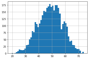
df['CHOP14'].hist(bins=50)
<AxesSubplot:>
#https://github.com/matplotlib/mplfinance
#this package help visualize financial data
import mplfinance as mpf
import matplotlib.colors as mcolors

# all_colors = list(mcolors.CSS4_COLORS.keys())#"CSS Colors"
all_colors = list(mcolors.TABLEAU_COLORS.keys()) # "Tableau Palette",
# all_colors = list(mcolors.BASE_COLORS.keys()) #"Base Colors",


#https://github.com/matplotlib/mplfinance/issues/181#issuecomment-667252575
#list of colors: https://matplotlib.org/stable/gallery/color/named_colors.html
#https://github.com/matplotlib/mplfinance/blob/master/examples/styles.ipynb

def make_3panels2(main_data, mid_panel, chart_type='candle', names=None,
                  figratio=(14,9), fill_weights = (0, 0)):
    """
    main chart type: default is candle. alternatives: ohlc, line

    example:
    start = 200

    names = {'main_title': 'MAMA: MESA Adaptive Moving Average',
             'sub_tile': 'S&P 500 (^GSPC)', 'y_tiles': ['price', 'Volume [$10^{6}$]']}


    make_candle(df.iloc[-start:, :5], df.iloc[-start:][['MAMA', 'FAMA']], names = names)

    """

    style = mpf.make_mpf_style(base_mpf_style='yahoo',  #charles
                               base_mpl_style = 'seaborn-whitegrid',
#                                marketcolors=mpf.make_marketcolors(up="r", down="#0000CC",inherit=True),
                               gridcolor="whitesmoke",
                               gridstyle="--", #or None, or - for solid
                               gridaxis="both",
                               edgecolor = 'whitesmoke',
                               facecolor = 'white', #background color within the graph edge
                               figcolor = 'white', #background color outside of the graph edge
                               y_on_right = False,
                               rc =  {'legend.fontsize': 'small',#or number
                                      #'figure.figsize': (14, 9),
                                     'axes.labelsize': 'small',
                                     'axes.titlesize':'small',
                                     'xtick.labelsize':'small',#'x-small', 'small','medium','large'
                                     'ytick.labelsize':'small'
                                     },
                              )

    if (chart_type is None) or (chart_type not in ['ohlc', 'line', 'candle', 'hollow_and_filled']):
        chart_type = 'candle'
    len_dict = {'candle':2, 'ohlc':3, 'line':1, 'hollow_and_filled':2}

    kwargs = dict(type=chart_type, figratio=figratio, volume=True, volume_panel=2,
                  panel_ratios=(4,2,1), tight_layout=True, style=style, returnfig=True)

    if names is None:
        names = {'main_title': '', 'sub_tile': ''}


    added_plots = { }

    fb_bbands2_ = dict(y1=fill_weights[0]*np.ones(mid_panel.shape[0]),
                      y2=fill_weights[1]*np.ones(mid_panel.shape[0]),color="lightskyblue",alpha=0.1,interpolate=True)
    fb_bbands2_['panel'] = 1

    fb_bbands= [fb_bbands2_]


    i = 0
    for name_, data_ in mid_panel.iteritems():
        added_plots[name_] = mpf.make_addplot(data_, panel=1, color=all_colors[i])
        i = i + 1


    fig, axes = mpf.plot(main_data,  **kwargs,
                         addplot=list(added_plots.values()),
                         fill_between=fb_bbands)
    # add a new suptitle
    fig.suptitle(names['main_title'], y=1.05, fontsize=12, x=0.129)

    axes[0].set_title(names['sub_tile'], fontsize=10, style='italic',  loc='left')


#     axes[0].set_ylabel(names['y_tiles'][0])
#     axes[2].set_ylabel(names['y_tiles'][1])
    return fig, axes
start = -200
end = -1
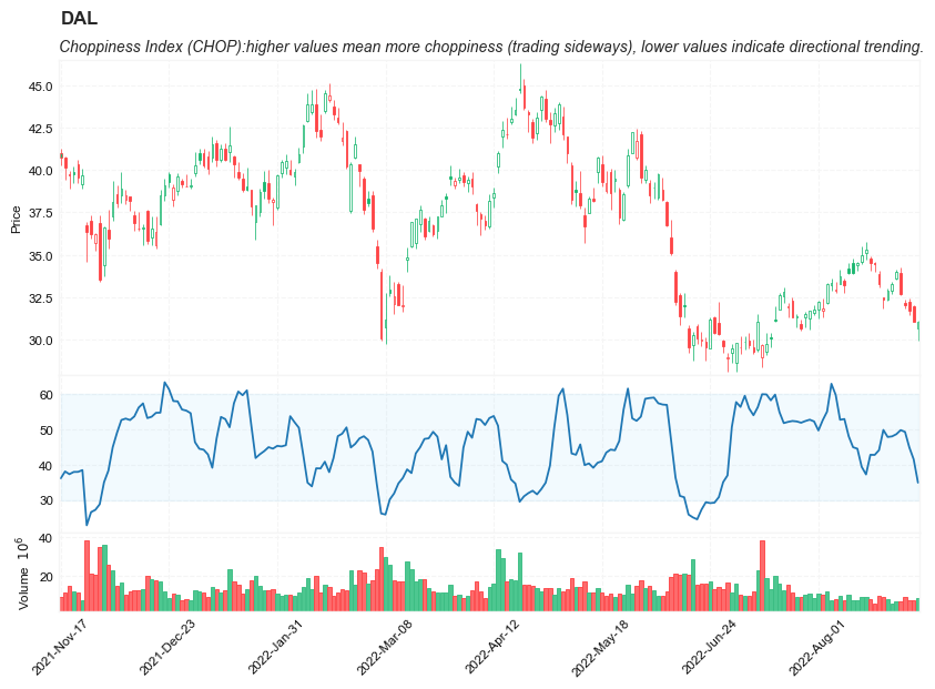
names = {'main_title': f'{ticker}',
'sub_tile': 'Choppiness Index (CHOP):higher values mean more choppiness (trading sideways), lower values indicate directional trending.'}
aa_, bb_ = make_3panels2(df.iloc[start:end][['Open', 'High', 'Low', 'Close', 'Volume']],
df.iloc[start:end][['CHOP14']],
chart_type='hollow_and_filled',names = names,
fill_weights = (30, 60))