Moving Average Convergence/Divergence (MACD)
References
Definition
MACD is an extremely popular indicator used in technical analysis. MACD can be used to identify aspects of a security's overall trend. Most notably these aspects are momentum, as well as trend direction and duration. What makes MACD so informative is that it is actually the combination of two different types of indicators.
First, MACD employs two Moving Averages of varying lengths (which are lagging indicators) to identify trend direction and duration. Then, MACD takes the difference in values between those two Moving Averages (MACD Line) and an EMA of those Moving Averages (Signal Line) and plots that difference between the two lines as a histogram which oscillates above and below a center Zero Line. The histogram is used as a good indication of a security's momentum.
The creation of the MACD as we know it can be split into two separate events.
In the 1970's, Gerald Appel created the MACD line. In 1986, Thomas Aspray added the histogram feature to Appel's MACD. Aspray's contribution served as a way to anticipate (and therefore cut down on lag) possible MACD crossovers which are a fundamental part of the indicator.
Calculation
- MACD Line: (12-day EMA - 26-day EMA)
- Signal Line: 9-day EMA of MACD Line
- MACD Histogram: MACD Line - Signal Line
Load basic packages
import pandas as pd
import numpy as np
import os
import gc
import copy
from pathlib import Path
from datetime import datetime, timedelta, time, date
#this package is to download equity price data from yahoo finance
#the source code of this package can be found here: https://github.com/ranaroussi/yfinance/blob/main
import yfinance as yf
pd.options.display.max_rows = 100
pd.options.display.max_columns = 100

import warnings
warnings.filterwarnings("ignore")

import pytorch_lightning as pl
random_seed=1234
pl.seed_everything(random_seed)
Global seed set to 1234


1234
#S&P 500 (^GSPC),  Dow Jones Industrial Average (^DJI), NASDAQ Composite (^IXIC)
#Russell 2000 (^RUT), Crude Oil Nov 21 (CL=F), Gold Dec 21 (GC=F)
#Treasury Yield 10 Years (^TNX)

#benchmark_tickers = ['^GSPC', '^DJI', '^IXIC', '^RUT',  'CL=F', 'GC=F', '^TNX']

benchmark_tickers = ['^GSPC']
tickers = benchmark_tickers + ['GSK', 'NVO', 'AROC']
#https://github.com/ranaroussi/yfinance/blob/main/yfinance/base.py
#     def history(self, period="1mo", interval="1d",
#                 start=None, end=None, prepost=False, actions=True,
#                 auto_adjust=True, back_adjust=False,
#                 proxy=None, rounding=False, tz=None, timeout=None, **kwargs):

dfs = {}

for ticker in tickers:
    cur_data = yf.Ticker(ticker)
    hist = cur_data.history(period="max", start='2000-01-01')
    print(datetime.now(), ticker, hist.shape, hist.index.min(), hist.index.max())
    dfs[ticker] = hist
2022-08-20 23:05:35.331135 ^GSPC (5696, 7) 1999-12-31 00:00:00 2022-08-19 00:00:00
2022-08-20 23:05:35.800308 GSK (5696, 7) 1999-12-31 00:00:00 2022-08-19 00:00:00
2022-08-20 23:05:36.253122 NVO (5696, 7) 1999-12-31 00:00:00 2022-08-19 00:00:00
2022-08-20 23:05:36.614884 AROC (3777, 7) 2007-08-21 00:00:00 2022-08-19 00:00:00
ticker = 'AROC'
dfs[ticker].tail(5)
| Open | High | Low | Close | Volume | Dividends | Stock Splits | |
|---|---|---|---|---|---|---|---|
| Date | |||||||
| 2022-08-15 | 7.69 | 7.75 | 7.54 | 7.71 | 589800 | 0.0 | 0 |
| 2022-08-16 | 7.77 | 7.83 | 7.60 | 7.63 | 543400 | 0.0 | 0 |
| 2022-08-17 | 7.56 | 7.67 | 7.56 | 7.61 | 527500 | 0.0 | 0 |
| 2022-08-18 | 7.70 | 7.80 | 7.68 | 7.79 | 457700 | 0.0 | 0 |
| 2022-08-19 | 7.75 | 7.75 | 7.62 | 7.62 | 569100 | 0.0 | 0 |
Define MACD calculation function
#https://github.com/peerchemist/finta/blob/af01fa594995de78f5ada5c336e61cd87c46b151/finta/finta.py#L935
def cal_macd(
    ohlc: pd.DataFrame,
    fast_period: int = 12,
    slow_period: int = 26,
    signal: int = 9,
    column: str = "close",
    adjust: bool = True,
) -> pd.DataFrame:
    """
    MACD, MACD Signal and MACD difference.
    The MACD Line oscillates above and below the zero line, which is also known as the centerline.
    These crossovers signal that the 12-day EMA has crossed the 26-day EMA. The direction, of course, depends on the direction of the moving average cross.
    Positive MACD indicates that the 12-day EMA is above the 26-day EMA. Positive values increase as the shorter EMA diverges further from the longer EMA.
    This means upside momentum is increasing. Negative MACD values indicates that the 12-day EMA is below the 26-day EMA.
    Negative values increase as the shorter EMA diverges further below the longer EMA. This means downside momentum is increasing.

    Signal line crossovers are the most common MACD signals. The signal line is a 9-day EMA of the MACD Line.
    As a moving average of the indicator, it trails the MACD and makes it easier to spot MACD turns.
    A bullish crossover occurs when the MACD turns up and crosses above the signal line.
    A bearish crossover occurs when the MACD turns down and crosses below the signal line.
    """

    EMA_fast = pd.Series(
        ohlc[column].ewm(ignore_na=False, span=fast_period, adjust=adjust).mean(),
        name="EMA_fast",
    )
    EMA_slow = pd.Series(
        ohlc[column].ewm(ignore_na=False, span=slow_period, adjust=adjust).mean(),
        name="EMA_slow",
    )
    MACD = pd.Series(EMA_fast - EMA_slow, name="MACD")
    MACD_signal = pd.Series(
        MACD.ewm(ignore_na=False, span=signal, adjust=adjust).mean(), name="SIGNAL"
    )

    return pd.concat([MACD, MACD_signal], axis=1)
Calculate MACD
df = dfs[ticker][['Open', 'High', 'Low', 'Close', 'Volume']]
df = df.round(2)
cal_macd
<function __main__.cal_macd(ohlc: pandas.core.frame.DataFrame, fast_period: int = 12, slow_period: int = 26, signal: int = 9, column: str = 'close', adjust: bool = True) -> pandas.core.frame.DataFrame>
df_ta = cal_macd(df, fast_period = 12, slow_period = 26, signal = 9, column = 'Close')
df = df.merge(df_ta, left_index = True, right_index = True, how='inner' )

del df_ta
gc.collect()
106
display(df.head(5))
display(df.tail(5))
| Open | High | Low | Close | Volume | MACD | SIGNAL | |
|---|---|---|---|---|---|---|---|
| Date | |||||||
| 2007-08-21 | 50.01 | 50.86 | 49.13 | 49.44 | 1029100 | 0.000000 | 0.000000 |
| 2007-08-22 | 48.50 | 50.70 | 47.78 | 49.29 | 996500 | -0.003365 | -0.001870 |
| 2007-08-23 | 49.76 | 49.82 | 47.56 | 48.03 | 742700 | -0.043361 | -0.018874 |
| 2007-08-24 | 47.93 | 48.77 | 47.87 | 48.58 | 416000 | -0.040631 | -0.026244 |
| 2007-08-27 | 48.56 | 48.81 | 46.85 | 47.47 | 447000 | -0.082462 | -0.042968 |
| Open | High | Low | Close | Volume | MACD | SIGNAL | |
|---|---|---|---|---|---|---|---|
| Date | |||||||
| 2022-08-15 | 7.69 | 7.75 | 7.54 | 7.71 | 589800 | -0.117460 | -0.126132 |
| 2022-08-16 | 7.77 | 7.83 | 7.60 | 7.63 | 543400 | -0.122610 | -0.125428 |
| 2022-08-17 | 7.56 | 7.67 | 7.56 | 7.61 | 527500 | -0.126843 | -0.125711 |
| 2022-08-18 | 7.70 | 7.80 | 7.68 | 7.79 | 457700 | -0.114356 | -0.123440 |
| 2022-08-19 | 7.75 | 7.75 | 7.62 | 7.62 | 569100 | -0.116830 | -0.122118 |
#https://github.com/matplotlib/mplfinance
#this package help visualize financial data
import mplfinance as mpf
import matplotlib.colors as mcolors

# all_colors = list(mcolors.CSS4_COLORS.keys())#"CSS Colors"
all_colors = list(mcolors.TABLEAU_COLORS.keys()) # "Tableau Palette",
# all_colors = list(mcolors.BASE_COLORS.keys()) #"Base Colors",


#https://github.com/matplotlib/mplfinance/issues/181#issuecomment-667252575
#list of colors: https://matplotlib.org/stable/gallery/color/named_colors.html
#https://github.com/matplotlib/mplfinance/blob/master/examples/styles.ipynb

def plot_macd(main_data, mid_panel, chart_type='candle', names=None,
                  figratio=(14,9)):


    style = mpf.make_mpf_style(base_mpf_style='yahoo',  #charles
                               base_mpl_style = 'seaborn-whitegrid',
#                                marketcolors=mpf.make_marketcolors(up="r", down="#0000CC",inherit=True),
                               gridcolor="whitesmoke",
                               gridstyle="--", #or None, or - for solid
                               gridaxis="both",
                               edgecolor = 'whitesmoke',
                               facecolor = 'white', #background color within the graph edge
                               figcolor = 'white', #background color outside of the graph edge
                               y_on_right = False,
                               rc =  {'legend.fontsize': 'small',#or number
                                      #'figure.figsize': (14, 9),
                                     'axes.labelsize': 'small',
                                     'axes.titlesize':'small',
                                     'xtick.labelsize':'small',#'x-small', 'small','medium','large'
                                     'ytick.labelsize':'small'
                                     },
                              )

    if (chart_type is None) or (chart_type not in ['ohlc', 'line', 'candle', 'hollow_and_filled']):
        chart_type = 'candle'
    len_dict = {'candle':2, 'ohlc':3, 'line':1, 'hollow_and_filled':2}

    kwargs = dict(type=chart_type, figratio=figratio, volume=False,
                  panel_ratios=(4,2), tight_layout=True, style=style, returnfig=True)

    if names is None:
        names = {'main_title': '', 'sub_tile': ''}


    added_plots = {
        'MACD': mpf.make_addplot(mid_panel['MACD'], panel=1, color='dodgerblue', secondary_y=False),
        'SIGNAL': mpf.make_addplot(mid_panel['SIGNAL'], panel=1, color='tomato', secondary_y=False),
        'MACD-SIGNAL': mpf.make_addplot(mid_panel['MACD']-mid_panel['SIGNAL'], type='bar',width=0.7,panel=1, color="pink",alpha=0.65,secondary_y=False),
    }


    fig, axes = mpf.plot(main_data,  **kwargs,
                         addplot=list(added_plots.values()),
                        )
    # add a new suptitle
    fig.suptitle(names['main_title'], y=1.05, fontsize=12, x=0.128)

    axes[0].set_title(names['sub_tile'], fontsize=10, style='italic',  loc='left')

    axes[2].set_title('MACD', fontsize=10, style='italic',  loc='left')


    #set legend

    axes[2].legend([None]*2)
    handles = axes[2].get_legend().legendHandles
#     print(handles)
    axes[2].legend(handles=handles,labels=['MACD', 'SIGNAL'])


#     axes[0].set_ylabel(names['y_tiles'][0])
#     axes[2].set_ylabel(names['y_tiles'][1])
    return fig, axes
start = -500
end = -400#df.shape[0]
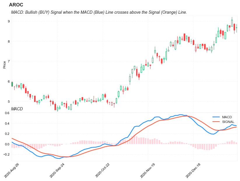
names = {'main_title': f'{ticker}',
'sub_tile': 'MACD: Bullish (BUY) Signal when the MACD (Blue) Line crosses above the Signal (Orange) Line.'}
aa_, bb_ = plot_macd(df.iloc[start:end][['Open', 'High', 'Low', 'Close', 'Volume']],
df.iloc[start:end][['MACD', 'SIGNAL']],
chart_type='hollow_and_filled',names = names)