Scatter plot
import pandas as pd
import numpy as np


#import matplotlib as mpl
import matplotlib.pyplot as plt
import seaborn as sns
import warnings; warnings.filterwarnings(action='once')

large = 22; med = 16; small = 12
params = {'axes.titlesize': large,
          'legend.fontsize': med,
          'figure.figsize': (16, 10),
          'axes.labelsize': med,
          'axes.titlesize': med,
          'xtick.labelsize': med,
          'ytick.labelsize': med,
          'figure.titlesize': large}
plt.rcParams.update(params)
plt.style.use('seaborn-whitegrid')
sns.set_style("white")
%matplotlib inline
load data
df_gold=pd.read_csv('data/GC=F.csv', sep='|')
df_sp500=pd.read_csv('data/^GSPC.csv', sep='|')
df_gold.head(2)
| Date | Open | High | Low | Close | Volume | Dividends | Stock Splits | |
|---|---|---|---|---|---|---|---|---|
| 0 | 2000-08-30 | 273.899994 | 273.899994 | 273.899994 | 273.899994 | 0 | 0 | 0 |
| 1 | 2000-08-31 | 274.799988 | 278.299988 | 274.799988 | 278.299988 | 0 | 0 | 0 |
df_sp500.head(2)
| Date | Open | High | Low | Close | Volume | Dividends | Stock Splits | |
|---|---|---|---|---|---|---|---|---|
| 0 | 1950-01-03 | 16.66 | 16.66 | 16.66 | 16.66 | 1260000 | 0 | 0 |
| 1 | 1950-01-04 | 16.85 | 16.85 | 16.85 | 16.85 | 1890000 | 0 | 0 |
#combine data
combine=df_gold[['Date', 'Close']].merge(df_sp500[['Date', 'Close']], on=['Date'], how='inner')
combine.head()
| Date | Close_x | Close_y | |
|---|---|---|---|
| 0 | 2000-08-30 | 273.899994 | 1502.589966 |
| 1 | 2000-08-31 | 278.299988 | 1517.680054 |
| 2 | 2000-09-01 | 277.000000 | 1520.770020 |
| 3 | 2000-09-05 | 275.799988 | 1507.079956 |
| 4 | 2000-09-06 | 274.200012 | 1492.250000 |
combine.columns=['date', 'gold_price','sp500_price']
combine.head(2)
| date | gold_price | sp500_price | |
|---|---|---|---|
| 0 | 2000-08-30 | 273.899994 | 1502.589966 |
| 1 | 2000-08-31 | 278.299988 | 1517.680054 |
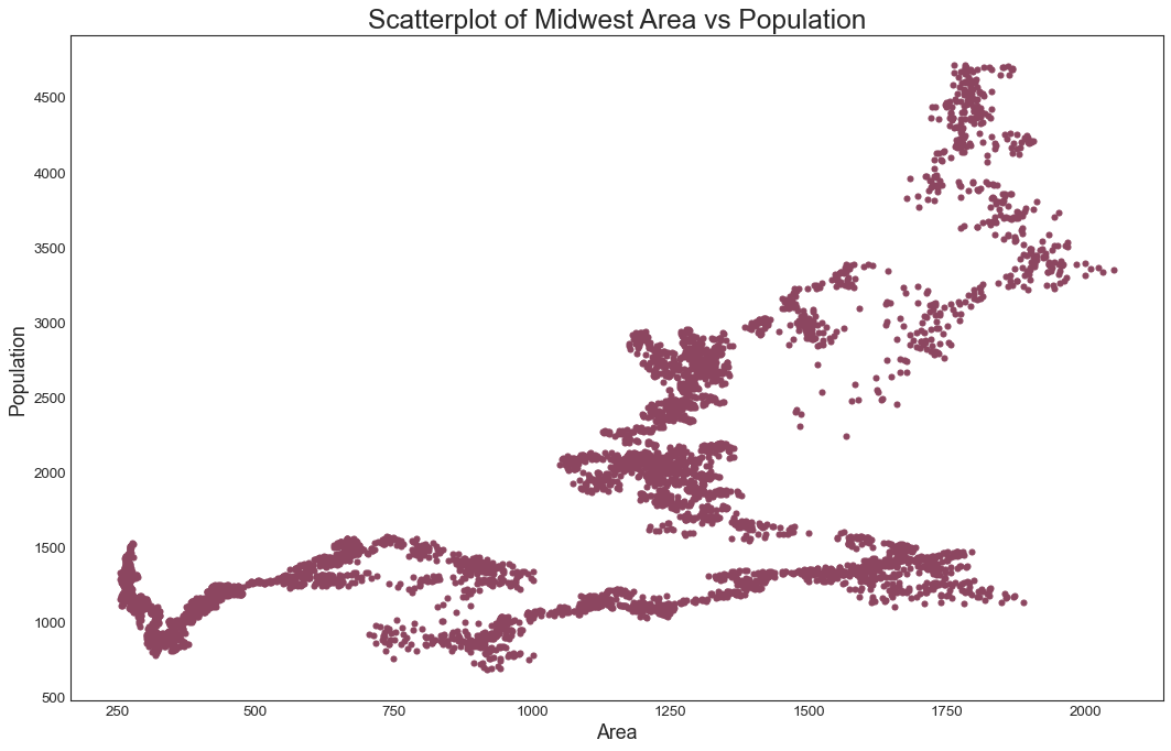
x=combine['gold_price']
y=combine['sp500_price']
Plot the graph
plt.figure(figsize=(16,10), dpi= 80)
plt.scatter(x=x, y=y,s=20, c='#8C4660')

# Decorations
plt.gca().set(#xlim=(0.0, 0.1), ylim=(0, 90000),
              xlabel='Area', ylabel='Population')

plt.xticks(fontsize=12); plt.yticks(fontsize=12)
plt.title("Scatterplot of Midwest Area vs Population", fontsize=22)
plt.show()