Line Chart
notebook setup:
- Plot S&P 500 price on a line chart
- S&P 500 (^GSPC): data/^GSPC.csv
- color palette:
- the palette is downloaded from adobe
- colors

| Hex | RGBA | HSLA |
|---|---|---|
| #8C4660 | rgba(140,70,95, 1) | hsla(337, 33, 41, 1) |
| #7988D9 | rgba(121,135,216, 1) | hsla(230, 55, 66, 1) |
| #252940 | rgba(36,40,63, 1) | hsla(230, 26, 19, 1) |
| #54628C | rgba(84,98,140, 1) | hsla(225, 25, 44, 1) |
| #F2AEAE | rgba(242,174,174, 1) | hsla(0, 72, 81, 1) |
caution:
- it will take a long time to plot data with more than 5k samples (i.e. rows)
reference:
import pandas as pd
import numpy as np


import matplotlib as mpl
import matplotlib.pyplot as plt
import seaborn as sns
print('pandas version: ', pd.__version__)
print('numpy version: ', np.__version__)
print('matplotlib version: ', mpl.__version__)
print('seaborn version: ', sns.__version__)
pandas version:  1.3.4
numpy version:  1.21.4
matplotlib version:  3.5.0
seaborn version:  0.11.2
df=pd.read_csv('data/^GSPC.csv', sep='|')
df.head(2)
| Date | Open | High | Low | Close | Volume | Dividends | Stock Splits | |
|---|---|---|---|---|---|---|---|---|
| 0 | 1950-01-03 | 16.66 | 16.66 | 16.66 | 16.66 | 1260000 | 0 | 0 |
| 1 | 1950-01-04 | 16.85 | 16.85 | 16.85 | 16.85 | 1890000 | 0 | 0 |
df.info()
<class 'pandas.core.frame.DataFrame'>
RangeIndex: 18111 entries, 0 to 18110
Data columns (total 8 columns):
 #   Column        Non-Null Count  Dtype
---  ------        --------------  -----
 0   Date          18111 non-null  object
 1   Open          18111 non-null  float64
 2   High          18111 non-null  float64
 3   Low           18111 non-null  float64
 4   Close         18111 non-null  float64
 5   Volume        18111 non-null  int64
 6   Dividends     18111 non-null  int64
 7   Stock Splits  18111 non-null  int64
dtypes: float64(4), int64(3), object(1)
memory usage: 1.1+ MB
df=df.loc[df['Date']>='2010-01-01', ['Date', 'Close']].copy(deep=True)
df.shape
(3014, 2)
df.head(2)
| Date | Close | |
|---|---|---|
| 15097 | 2010-01-04 | 1132.98999 |
| 15098 | 2010-01-05 | 1136.52002 |
df.reset_index(inplace=True)
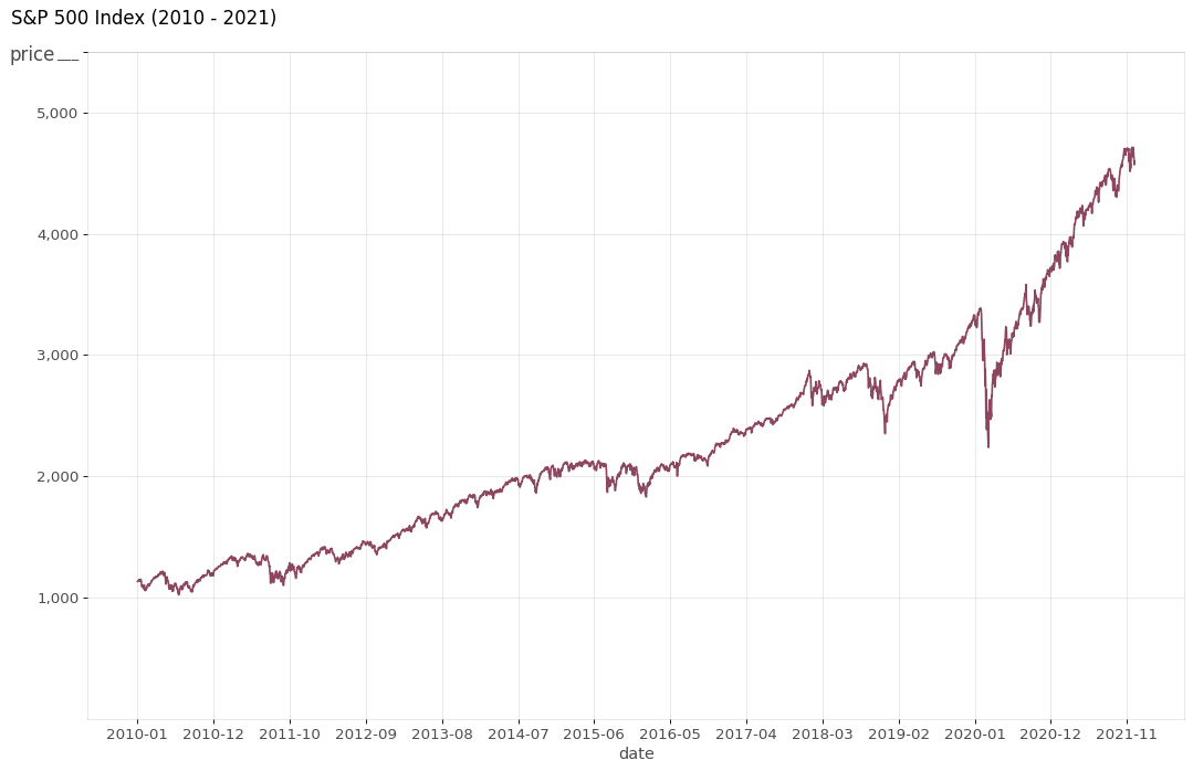
the following illustrates how to plot a line chart with customized labels
# the main part
plt.figure(figsize=(16,10), dpi= 80)
plt.plot('Date', 'Close', data=df, color='#8C4660')


# pretty up the graph
xtick_location = df.index.tolist()[::230]
xtick_labels = [x[:7] for x in df['Date'].tolist()[::230]]
plt.xticks(ticks=xtick_location, labels=xtick_labels, rotation=0, fontsize=12, horizontalalignment='center', alpha=.7)
plt.yticks(fontsize=12, alpha=.7)
plt.title("S&P 500 Index (2010 - 2021)", fontsize=15, loc='left', y=1.02, x=-0.04)
plt.grid(axis='both', alpha=.3)

# remove borders
plt.gca().spines["top"].set_alpha(0.1)
plt.gca().spines["bottom"].set_alpha(0.1)
plt.gca().spines["right"].set_alpha(0.1)
plt.gca().spines["left"].set_alpha(0.1)

plt.show()
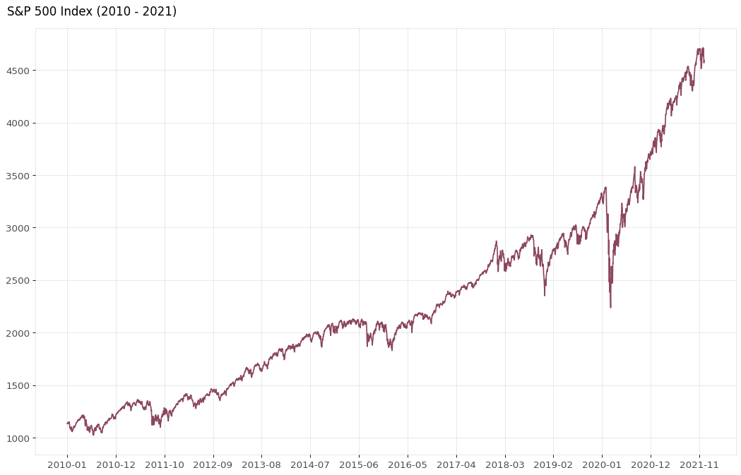
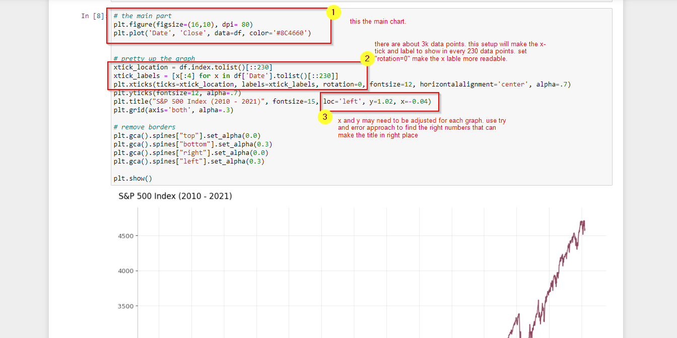
the following illustrates how to add titles to x-axis and y-axis
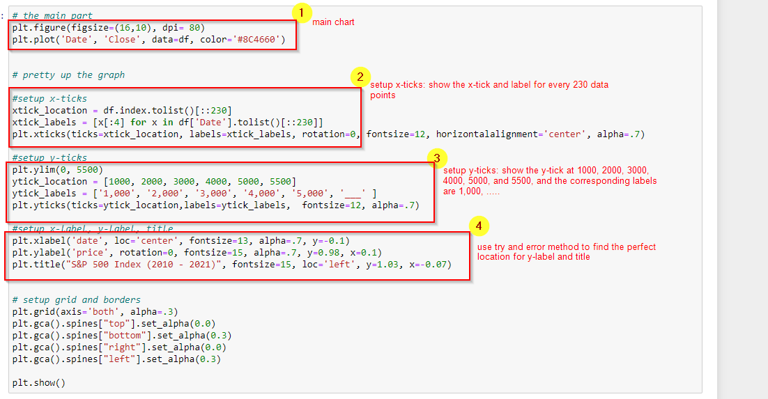
# the main part
plt.figure(figsize=(16,10), dpi= 80)
plt.plot('Date', 'Close', data=df, color='#8C4660')


# pretty up the graph

#setup x-ticks
xtick_location = df.index.tolist()[::230]
xtick_labels = [x[:7] for x in df['Date'].tolist()[::230]]
plt.xticks(ticks=xtick_location, labels=xtick_labels, rotation=0, fontsize=12, horizontalalignment='center', alpha=.7)

#setup y-ticks
plt.ylim(0, 5500)
ytick_location = [1000, 2000, 3000, 4000, 5000, 5500]
ytick_labels = ['1,000', '2,000', '3,000', '4,000', '5,000', '___' ]
plt.yticks(ticks=ytick_location,labels=ytick_labels,  fontsize=12, alpha=.7)

#setup x-label, y-label, title
plt.xlabel('date', loc='center', fontsize=13, alpha=.7, y=-0.1)
plt.ylabel('price', rotation=0, fontsize=15, alpha=.7, y=0.98, x=0.1)
plt.title("S&P 500 Index (2010 - 2021)", fontsize=15, loc='left', y=1.03, x=-0.07)


# setup grid and borders
plt.grid(axis='both', alpha=.3)
plt.gca().spines["top"].set_alpha(0.1)
plt.gca().spines["bottom"].set_alpha(0.1)
plt.gca().spines["right"].set_alpha(0.1)
plt.gca().spines["left"].set_alpha(0.1)

plt.show()