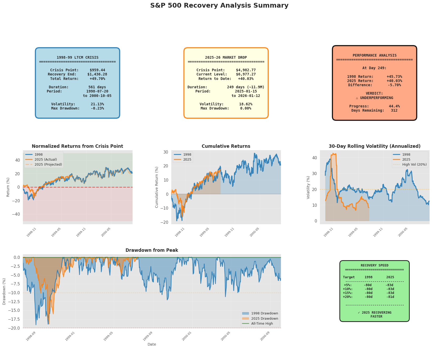
S&P 500 Recovery Pattern Analysis: 1998–99 vs 2025–26
This study compares post-trough recovery dynamics between:
- 1998 LTCM-era drawdown (benchmark; full 24-month window)
- 2025 market drop (current; partial window + optional projection)
It’s designed as a pattern-matching framework: align two recovery windows, quantify similarity/differences, and (optionally) generate a template-based forward path.
GITHUB · View Script · Nasdaq 100 Recovery Pattern
Comparison design
1) Anchoring event
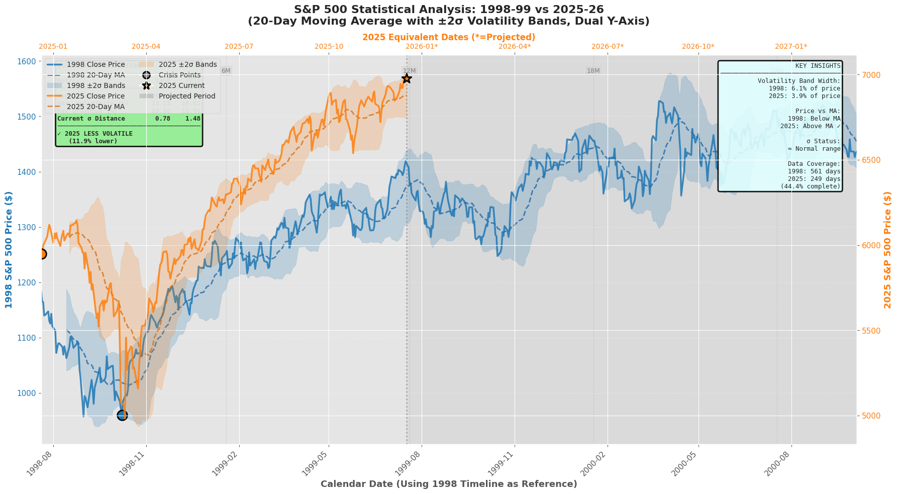
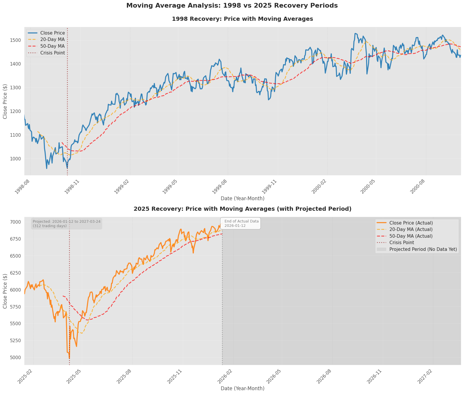
We define the “crisis point” as the intended trough date and snap to the nearest trading day:
- 1998 trough:
1998-10-08 - 2025 trough:
2025-04-08
2) Window construction
For each trough:
- include 57 prior trading days for context (pre-trough slope and volatility)
- analyze 24 months forward using \(21\) trading days/month: \(T \approx 57 + 24 \times 21\)
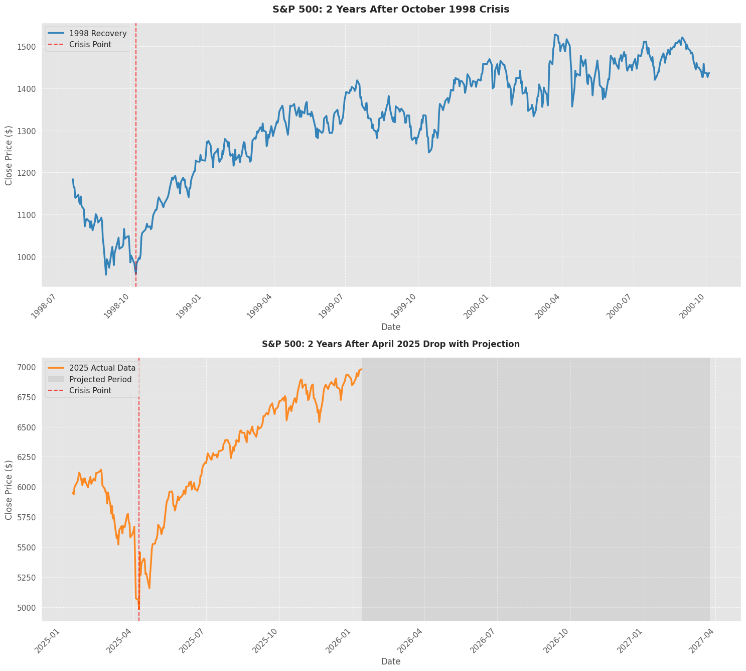
The 2025 window is padded with business days if it is shorter than the 1998 window to keep plotting/alignments consistent. Padded dates are treated as future / projected and are kept separate via an actual_mask.
Core transformations
Normalized path (shape comparison)
To compare shape, we normalize each recovery path to its first valid observation: \(\mathrm{norm}(P_t)=100\left(\frac{P_t}{P_0}-1\right)\)
Dual-timeline alignment (calendar overlay)
To overlay the 2025 path onto the 1998 axis, dates are shifted by a constant offset: \(t'_{2025} = t_{2025} + (t_{1998,0} - t_{2025,0})\)
This enables side-by-side inspection of “month \(m\) after trough” dynamics while still using readable calendar ticks.
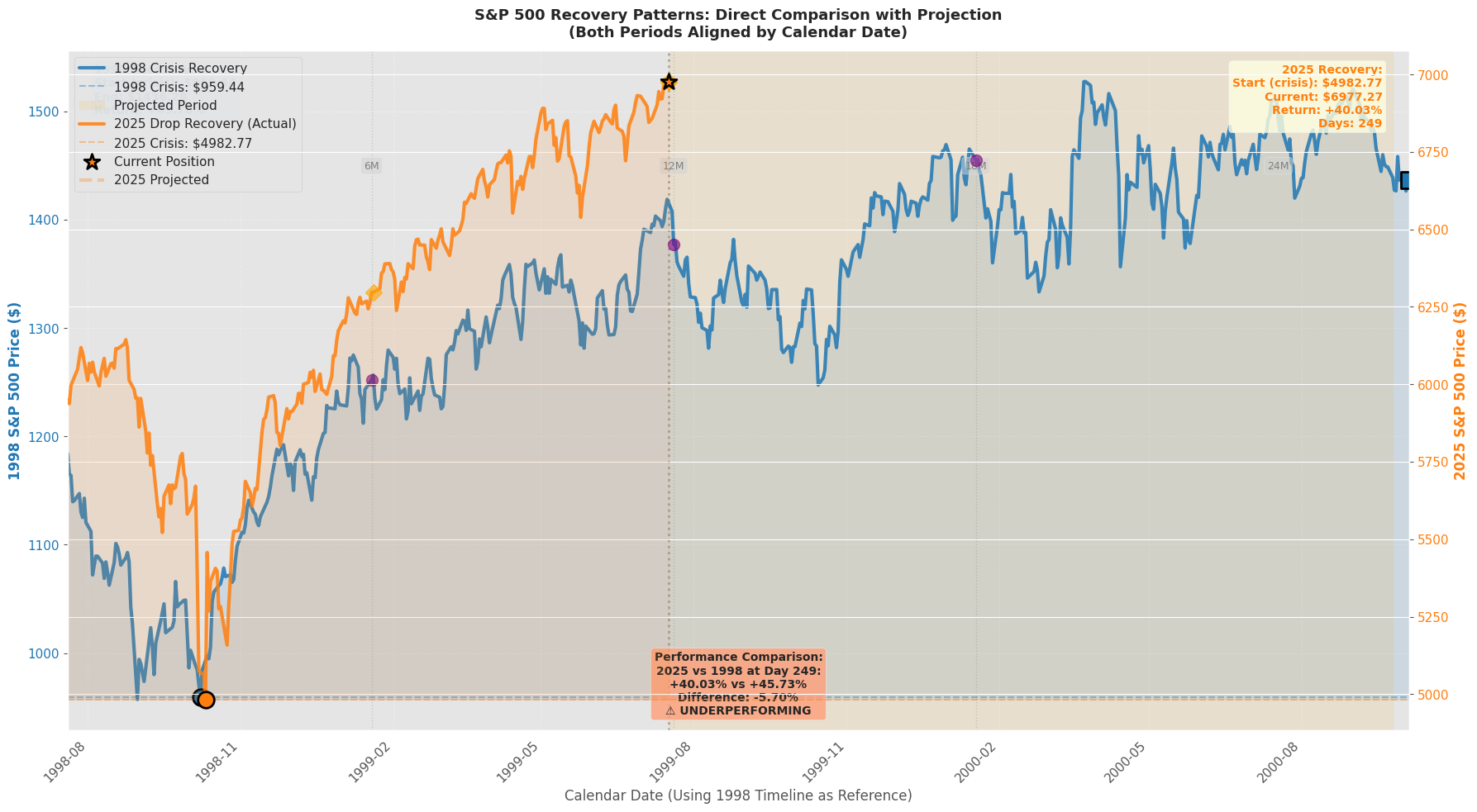
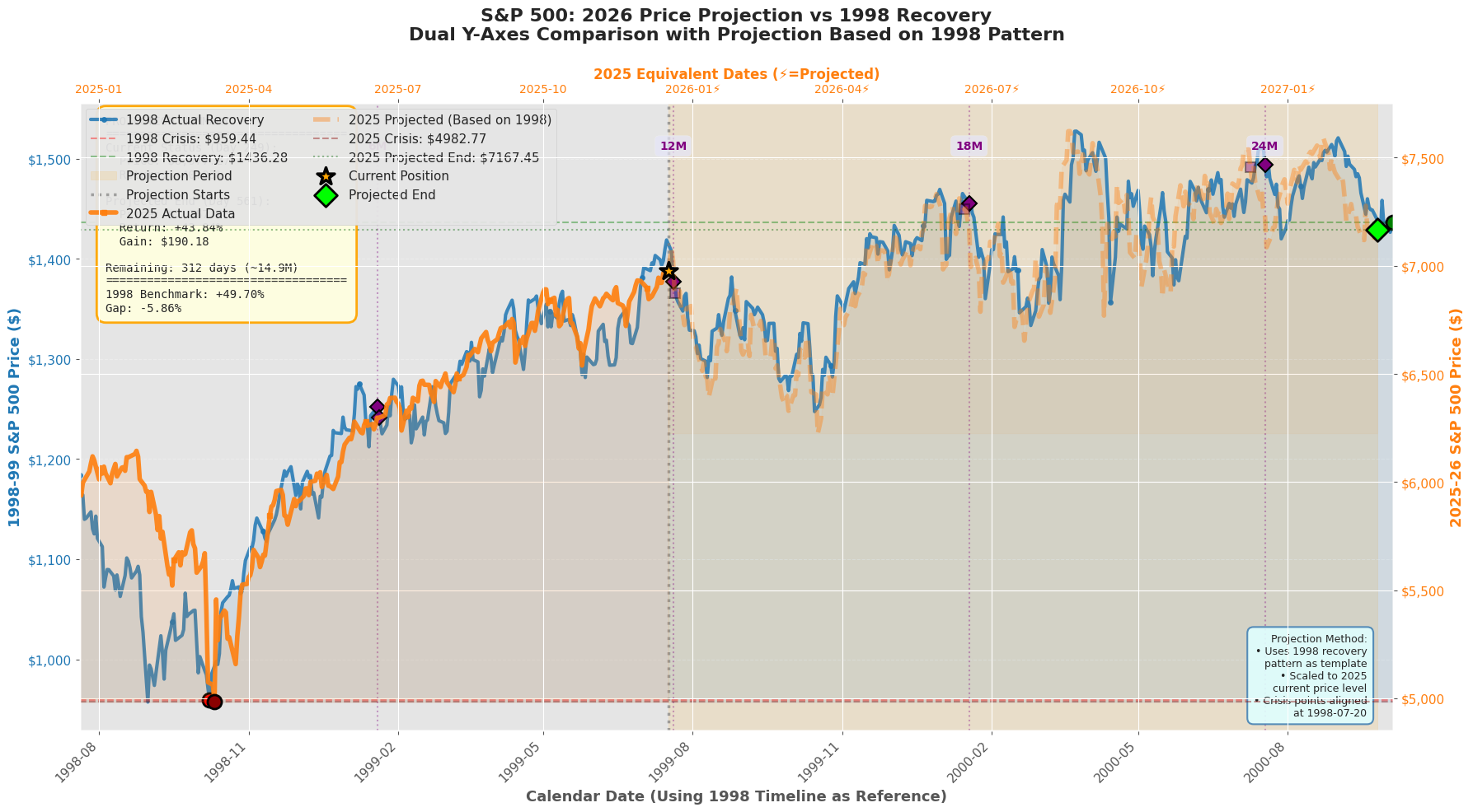
Projection method
When 2025 has fewer observations than the 1998 benchmark, the script can build a shape-implied continuation:
- Take the corresponding future segment of the 1998 recovery path.
- Scale it to the 2025 level using a multiplicative factor: \(\hat{P}^{2025}_{t} = P^{1998}_{t} \times \frac{P^{2025}_{\text{last actual}}}{P^{1998}_{\text{reference}}}\)
- Fill only as many padded future rows as safely available (length-safe, no index errors).
Interpretation: this is a conditional path hypothesis: “If 2025 follows the shape of 1998 from this point, what would the implied level path look like?”
Recovery speed diagnostics
To make “pace” comparable, the script computes time-to-reach milestone gains from trough:
- +5%, +10%, +15%, +20%
For each gain threshold \(g\):
- find the first date where \(P_t \ge P_{\text{trough}}(1+g)\)
- report days elapsed for 1998 vs 2025 (actual only)
This yields an interpretable recovery speed table rather than relying purely on visual similarity.
Caveats
- This is not a causal forecast.
- Scenario panel (Viz 9) is assumption-driven and should not be treated as inference.
Visualizations
A set of plots intended to answer: “Is 2025 recovering like 1998, and if so, in what dimensions?”
- Absolute price paths (1998 full; 2025 actual + shaded projection region)
- Normalized recovery paths (aligned by start date; 0% reference line at trough)
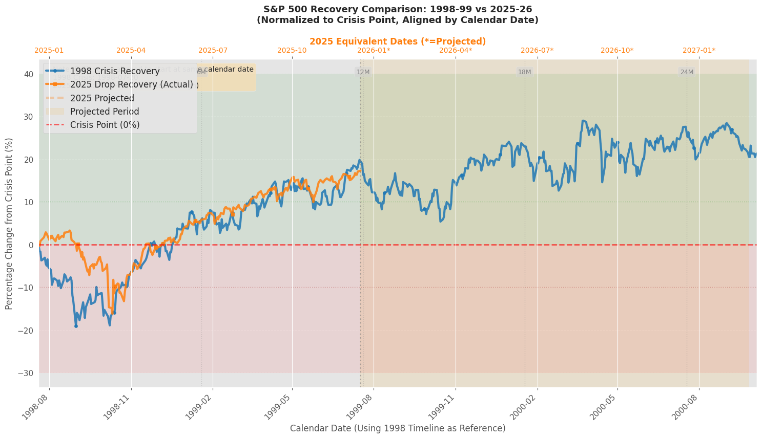
- Dual y-axis overlay (1998 on left axis, 2025 on right axis; same x-grid)
- 20D moving average + ±2σ bands (volatility regime and stabilization check)
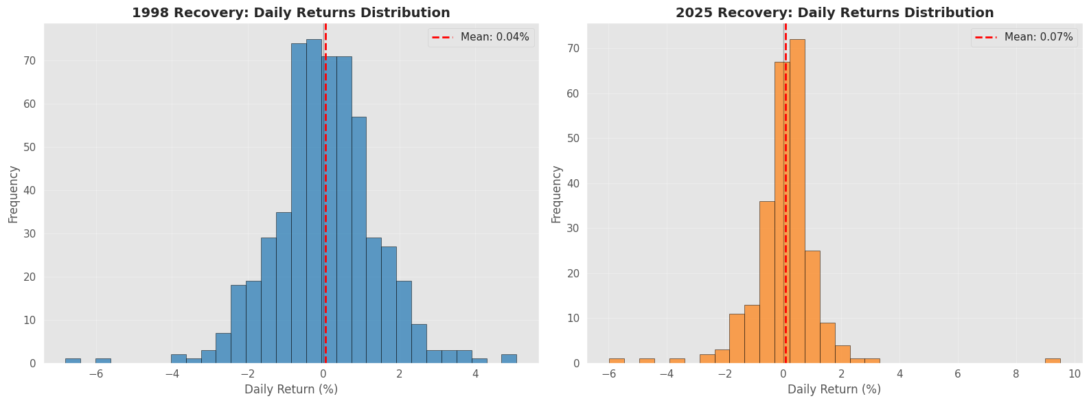
- Daily return distributions (mean/dispersion/skew differences)
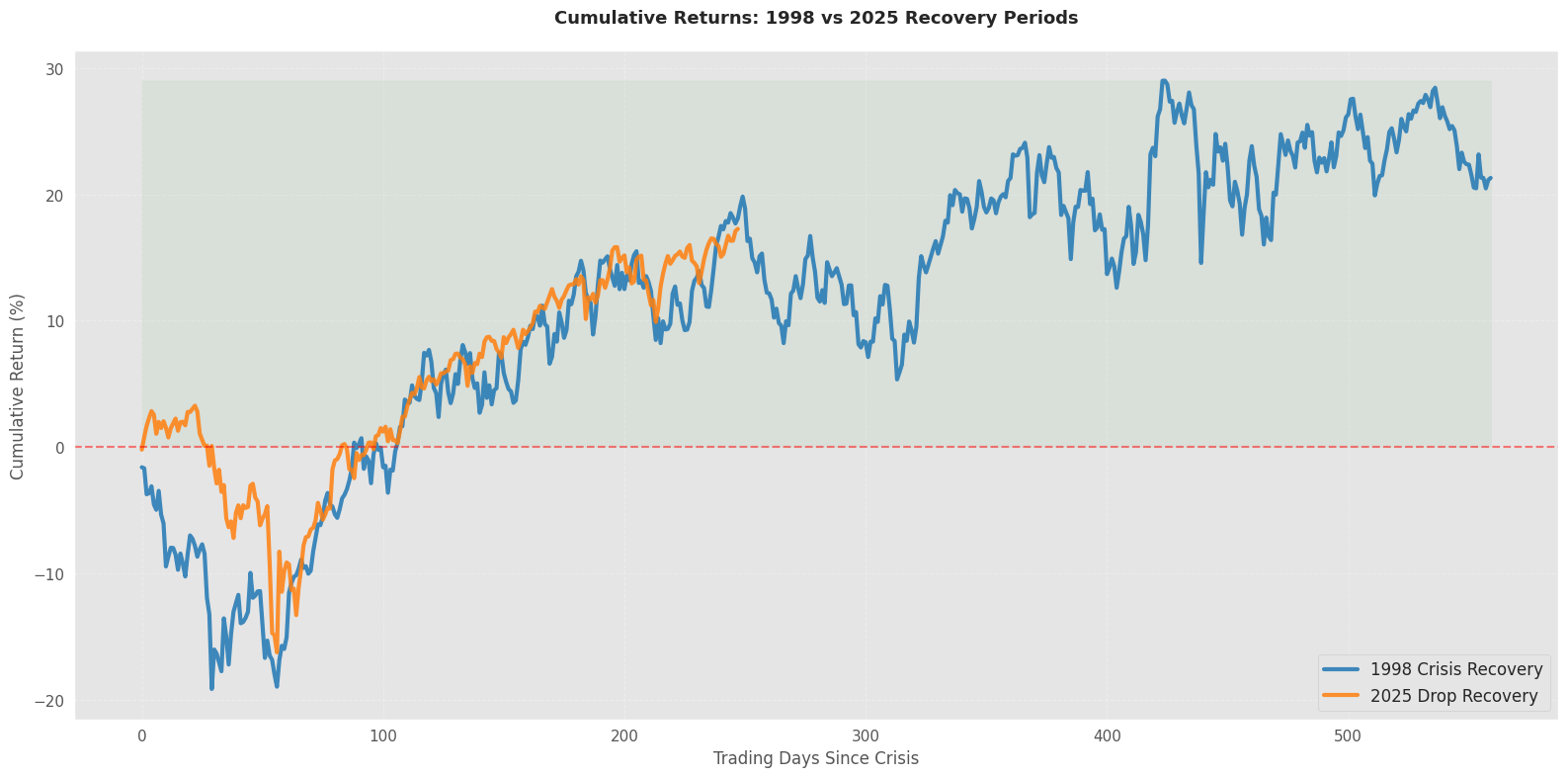
- Cumulative returns since trough (path dependence)
- Moving averages (20D/50D) (trend and time-to-signal; guarded for short samples)
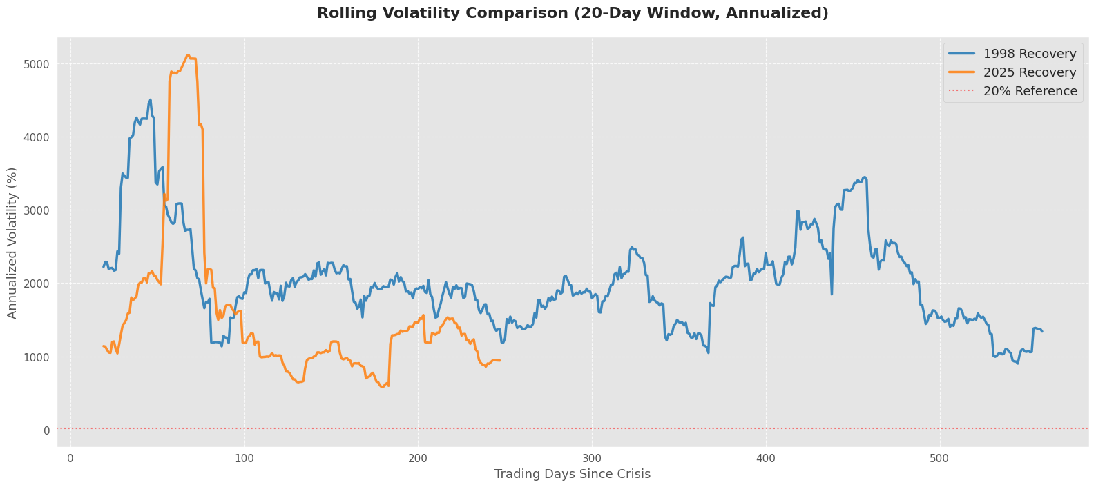
- Rolling realized volatility (annualized; windowed; 20% reference level)
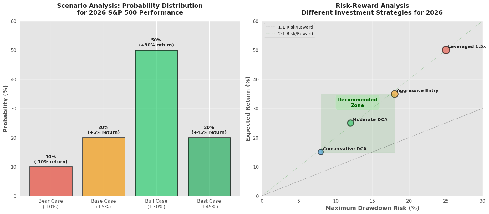
- Risk–reward scenario panel (explicit assumptions; not model-estimated)
- Template-based projection (scale 1998 “future segment” to 2025 price level)
- Summary Dashboard